
In Brand Design
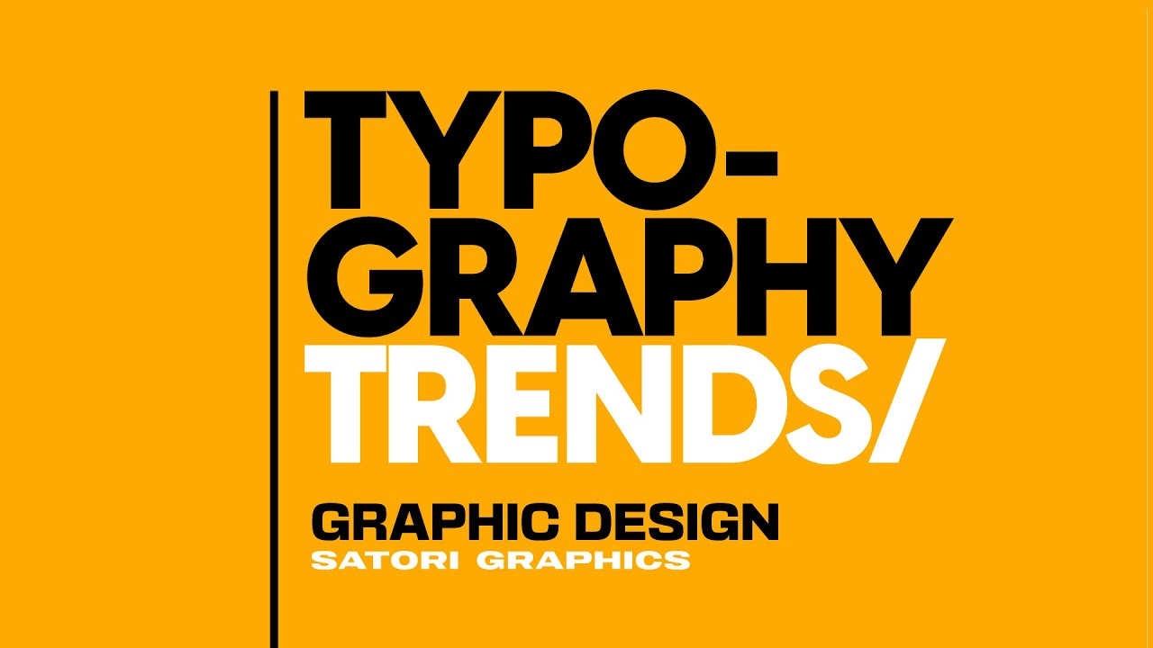
Typography Trends That Will BLOW UP In 2022! - read the full article about brand design trends, Brand Design and from Satori Graphics on Qualified.One

Youtube Blogger
back in march i made a video about typography trends of 2021 and a lot of those typography trends have been seen throughout this year you know we have things like outline text and disruptive typography and theyve been found all over the design world but what can we expect to see in the new year in terms of typography trends well lets take a look and see what weve got to play with and later in todays video you can learn about the awesome design tool that helps you create sleek modern and nifty websites its readymag the design tool thats built right into your browser radio mag is offering you guys the satori viewers a great promotion so learn more about that later in todays video so after doing a lot of research and with my ear firmly to the ground it seems there is a huge potential for four specific stars for typography to really take off in a big way next year the first one being the use of really wide and stretched typography that kind of appears short in nature this has already started to make an appearance this year but it really could take a hold in 2022 this style of typography is often created using modern sans-serif fonts and is presented in uppercase letter forms it works really well with short phrases or words and it really does come across as modern and trendy there are specific fonts that carry this style naturally two of which are neutral and also vlanella bold now i dont suggest that you manually stretch your typography because that kind of distorts the style of the typeface rather its best to seek out fonts such as vladnella and nutro if you really want to make use of this trend the next possible trend to take off is one that is used by designers who work on magazine covers and that is to obscure the full word or phrase with an object in the foreground and this is often seen on the title or the name of a magazine and then the model usually hides part of the lettering with their form however this is now spilling over into the greater design community and its becoming a very popular design method this technique often shows that the brand or the company is recognizable just by the style of the font alone without being able to read the letters and vogue is a magazine that has done this over and over again throughout history the technique shows how well an established vogue is because people recognize it without being able to read the actual words but yeah this is now moving over to the design world as a whole and something else that designers are utilizing is cutting off parts of the word to the left or to the right of the design again this is a playful tactic that can create a visually appealing design the third trend that actually isnt going to be exclusive to next year but likely to many many years in the future is animated typography now that we have so many design programs that enable us to make emotion graphics and lots of tech to easily view those graphics on designs are becoming more and more animated and less static this is also of course true to typography this has already been shown on my channel when we look at top tier design portfolios that include animated functions and typography its a way to show off not only skills as a graphic designer but to showcase how far technology has advanced in our time when animating typography you should always aim to include the style of animation that fits the font choice and the message of your design it is wise to start the time frame with the font on wording already visible as a whole and then carry out the animation thereafter you want people to read the text at first glance and then to see the animation but yeah expect to see more and more animated typography as time goes on the fourth trend that you should look for in 2022 and possibly use on your design work when the time is right of course is outline typography yes this has been trending this year i did talk about it in much but its likely going to carry over into the next year and dominate the graphic design world its been seen in adverts on tv tv shows magazines pretty much everywhere this technique is often done with bold sans-serif fonts and in uppercase letters designers will pair outline typography with filled typography of the same font and this creates some contrast and hierarchy yeah its super easy to do and in the right context it can look awesome but that is the important thing to consider with every method or technique your research and the brief should let you know if its valid or not to be used often your design wont work or function by using any of these techniques because the brief doesnt align with it imagine an easy to use drag and drop editor for creating your websites something built directly into your browser well thats the sponsor of todays video ready mac now it couldnt be easier to use and for someone like myself who hasnt even bothered to learn code its a great asset in my design arsenal you all know how i feel about fonts and typography i really cannot get enough of them and so when i realized that readymag has an ever growing collection of over 5000 web fonts from places like typekit web type google and so on i had to take a closer look at this design tool i also took a closer look at some of the existing designs created with readymag which you can do as well for inspiration on their examples page and if you build websites for clients then you can turn project pages into templates and reuse them to speed up your workflow and clients can even check your project via password-protected link using readymag or alternatively you can use the collaboration function that allows you to invite other people onto your projects to work together now you can try readymag right now by signing up for free without the use of a credit card and with the studio plan you can create as many projects as you want and map up to five domains on your account and also you can invite up to five collaborators to your projects but to you guys the viewers of my channel there is a promo code satori 50 thats going to allow the first 50 users to sign up to the studio plan for just 20 so yeah give really a mag a go and see how you can improve your websites today but if you want to learn more about typography or graphic design do click a video on screen and until next time guys design your future today aint nobody else want me darling just stay your love helps me maintain lay up in this bed
Satori Graphics: Typography Trends That Will BLOW UP In 2022! - Brand Design