In Content Marketing
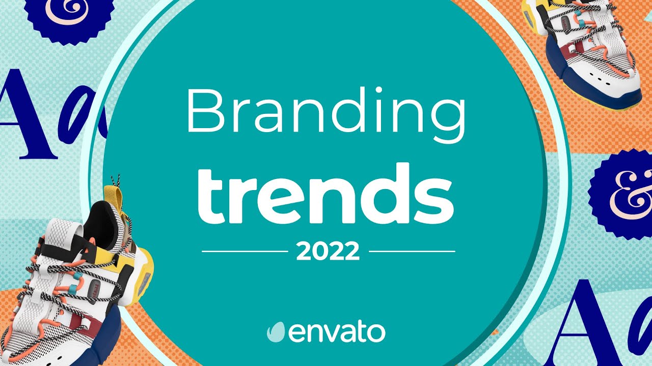
Branding Trends 2022 - read the full article about content marketing trends, Content Marketing and Content creation and promotion from Envato on Qualified.One

Youtube Blogger

Hey there! Jen McKinnon here and it’s time for another trend roundup from Envato. Today we’re taking a look at branding trends and a link to a collection of the featured items can be found in the description below.
This video is brought to you by Envato Elements, a subscription-based library full of all the digital creative assets you need to get your creative projects done. From content marketing design templates to illustration packs, customisable business cards and unique typefaces, everything you need to create better and faster is at your fingertips.
Check the link in the description for a special offer from the Envato Elements team to get you started. Let’s get into it! Wearing your heart on your sleeve has never been more important as consumers increasingly want to interact with brands that share their values. From sustainability to social justice, this trend is all about communicating your commitment to making positive change. Just look at Patagonia, a brand that dedicates a section of its website to talk about the steps the company is taking to minimise its impact.
Blog posts, videos and statistics clearly explain Patagonia’s programmes and the progress they are making, while a series of bold statements in white type against a black background reassure customers that the brand is authentic and trust-worthy. From LGBTQ+ rights to gender equality, support the causes you care about and introduce them into your brand DNA with the design tools and templates in our Envato Elements Activism Collection. From customisable, ready-to-print posters and flyers to Instagram posts and stories, it’s easy to start spreading the word about the things your business cares about in real life and on social media. For more on brand activism, check out the Content For Good segment in our Social Media Trends video linked in the description. It’s packed with helpful hints to ensure your feed always attracts attention.
There’s a time and a place for competing colors and clashing typography, but this isn’t it. Upholding the less-is-more mantra, minimalism is all about white space, muted palettes and organic design.
And the trend is growing in popularity with brands who want their logo and imagery to convey just how their products and services will make consumers feel.
Nu offers a masterclass in visual language with its two-tone branding and packaging, taking inspiration from the makeup company’s two highlighter products.
One features rose tones, the other features yellow tones, so it makes sense that dusty pink and sandy white tones take centre stage in all their marketing material.
By keeping their branding natural, clean and luminous, Nu tells the consumer everything they need to know about its products. Allow your next branding assignment or personal project to revel in white space and natural imagery by taking a look at this Minimalism Collection that’s been especially curated by the Envato Elements Team.
From business cards and magazine templates to customizable PowerPoint and Keynote presentations, these uncluttered and uncomplicated designs demonstrate that minimalism can still have maximum impact. Are you tossing up between the simplicity of minimalism or something with a bit more ‘pow’? Our Minimalism vs Maximalism blog post can help you find the style right for your brand. You’ll find a link in the description below. Let us know in the comments which you prefer.
And to see how minimalism is making waves when it comes to web design, check out our Web Design Trends video. Expect the unexpected as we rip up the traditional graphic design rulebook.
This trend has its roots in the Anti-Design movement of the late 1960s and 1970s, which was a reaction to what some saw as Modernism’s quest for perfection.
A style that’s been revived today through the combined use of images, illustration and typography, we’re seeing more and more brands make a statement with colliding elements, striking colors and distorted shapes.
Like Up Banking, which completely subverts the stereotype of a financial institute as grey and boring with its sunset-red debit cards. Scrolling through its website, users are treated to a sense of 80s nostalgia, with its tropical neons, retro-inspired gifs and memes, and effortlessly cool icons – which are so laid back they are wearing sunglasses. Inject a sense of playfulness into your next project with this collection of characters that come in various poses and postures. With their overlapping elements and disproportionate dimensions, this flat illustration pack is inspired by the odd bodies trend, which once again confirms that quirky is often better than conventional. Similarly, this social media kit from Envato author dirtylinestudio promises to introduce some creative chaos into your Instagram feed. Featuring wavy text, images with inverted colors, ripped paper and crinkly plastic textures, use these 18 Photoshop styles to come up with posts that channel your inner punk. From odd bodies to geo abstract, find out more about the quirky illustration trends that are popping up in creative projects around the world in our round-up video. You’ll find a link in the description below. The German art school that gave its name to this design movement only ran for 14 years in the early 20th-century but it’s still influencing creativity today.
Attempting to close the gap between art and industry, we see this trend manifesting itself in geometric shapes, strong lines and sharp corners. Bauhaus is minimal and modern, and has a functional feel – which made it perfect when online collaboration platform UKO was deciding on its logo and visual identity. The platform connects teams and streamlines workflows, and this is communicated by a series of bold shapes and the fine lines that connect them, which has the overall effect of creating a colorful conveyor belt. Immediately, the static and animated illustrations show us that this company is all about organizing, sharing and problem-solving.
Bring Bauhaus into your branding work with any of the items from our collection linked below that features patterns, posters and typefaces, all of which have been inspired by the movement and are ideal for creating a range of creative content.
Similarly, these Bauhaus business card templates featuring asymmetrical tiles are both edgy and eye-catching, making them ideal for personal or professional branding projects. Whatever era you want to engage with, our Retro Design Trends video will take you there.
Watch as we move from 60s-inspired Pop Art and psychedelic design to the simple shapes and freeform typography of the 70s and onto instantly recognisable 80s influences like science fiction and Club Tropicana. It seems the darling of social media feeds and web design is here to stay, as we turn our attention to gradients. It might sound obvious, but the reason color variations are so popular is because they are so versatile – with so many creative applications. We’re seeing gradients used as photo overlays to connect images to a brand’s color palette, as a way of adding extra visual interest to words and sentences, and as subtle or standout backgrounds to illustrations.
Giving gradients a leading role is Lithuanian confectioner Laroché, which wraps its chocolate creations in vibrant packaging that aims to visualise the unique taste experience of flavors like ruby, caramel and bittersweet. Add a modern splash of color to your social media feed with ambient sunrise and sunset themed Instagram posts and stories. It’s never been easier to get content out the door with these Photoshop templates for inspirational quotes, product announcements and meet the team profiles.
For many designers, the past continues to be a rich source of inspiration and many are stepping back in time to add a fresh spin to much-loved symbols and instantly recognizable icons.
Take the branding for this Manila-based bakery, which shares a 70s free love vibe with its peace signs, heart-shaped glasses and ‘flour power’ stickers. We’re also seeing elements from our recent history making an appearance with pop culture references popping up in films, TV shows, marketing materials and social media feeds.
From high-school soap operas to handmade mixtapes, this Instagram pack unashamedly taps into a 90s aesthetic with its geometric shapes and clashing colors.
Channel a sense of nostalgia with our round-up of the 90s graphic design trends that are still having an impact on audiences everywhere.
From the distressed textures of grunge to the psychedelic swirls associated with rave culture, this blog post offers an inspiring trip down memory lane.
Welcome audiences into your world, invite interaction and build communities with this trend that’s shaping up to be an essential part of brand storytelling.
Like this Stranger Things event taking place in San Francisco and New York. The event drops fans straight into the Hawkins Lab where they can “discover the secrets within the walls,” and is marketed with a slick microsite featuring illustrations inspired by the show and behind-the-scenes images of what to expect on the night.
Whether you are hosting an event or an experience online or in real-life, a well designed landing page can make all the difference when it comes to building anticipation and boosting ticket sales. While this clean, grabbing landing page was purpose built to promote Apps, you can use the template to market your next event. Simply choose the light or dark design and customise the images and smart code and you’re away! Words take on a life of their own with this bright and bold branding trend, which encourages designers and marketers to take a fun approach to sharing text. Who needs images anyway? Not when you have animated letters and shapeshifting sentences, like this kinetic typography that conveys a sense of meaning through movement. However, this bold and playful trend doesn’t have to be 3D or animated to have an impact, as this static sans serif font from Envato author simonok shows us.
Hunky Dory is a bold display typeface with a childlike touch; and it’s relaxed, happy-go-lucky appearance makes it perfect for logos, packaging, branding and headlines that don’t want to take themselves too seriously.
For more typography trends, our round-up video introduces everything you need to know about retro, experimental and handwritten fonts – as well as a whole host of other lettering styles – and supplies the assets to help you achieve the text effect you are looking for. That does it for the branding trends you’ll be seeing this year. If this video was helpful, don’t forget to like it below so we know to keep producing more content like this.
And subscribe to the Envato YouTube channel to stay up to date with our latest content! Have your say and tell us what trends you’d like us to profile next in the comments below and hit the Envato blog for more trends and tips.
That’s all for now but if you’re keen to stick around, click the thumbnail at the top right of your screen for more trends, or hit the one at the bottom right of your screen to watch the next Envato video, selected just for you. See you next time.
Envato: Branding Trends 2022 - Content Marketing

