In Mobile App Development
Building a desktop design language with Flutter | Session - read the full article about flutter app development, Mobile App Development and Native and cross-platform solutions from Flutter on Qualified.One

Youtube Blogger
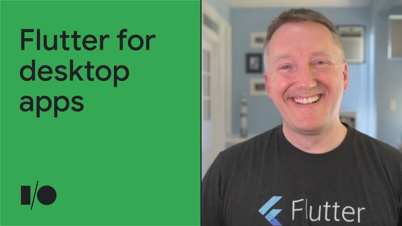
[MUSIC PLAYING] TODD VOLKERT: Hello, everyone.
My name is Todd Volkert, and Im an engineering manager on the Flutter team.
In this session, were going to talk about building a desktop design language with Flutter.
But before we get into the nitty-gritty, lets start by talking about why you might want to build a desktop-specific design language in Flutter.
So its known that Flutter comes with Material or Cupertino or iOS widgets out of the box.
This makes it a great choice for building mobile apps and getting rich design components right off the shelf.
What you may not have known is that the Material Design Library actually works great on desktop, too.
And if I were building a new app from scratch, I would definitely use it.
Its performant, beautiful, can adapt to desktop form-factors, and has all the features youd want out of a widget library straight out of the box.
Sometimes, however, your use case calls for a custom UI.
Or you might want your app to look like its using native platform widgets.
Maybe it even embeds native platform widgets-- or any number of other reasons that brings you to the conclusion that you kind of need to forge your own path.
Also, desktops can be different.
The idioms of desktops are so well-established that customers will sometimes have very specific preconceived notions of what their app should look like, and those notions can stretch way outside the bounds of Material Design.
And that last point really hits home for me, because I experienced that exact scenario.
Heres an app I wrote 14 years ago thats still in use today, but its being sunset and will soon stop working, so it needs to be reimplemented from scratch.
Lets take a quick tour and imagine writing this app in Flutter to see what widgets we would need to build.
And right off the bat, we notice that this doesnt look anything like a Material app.
Its a dense display, boring, corporate REST app that very much looks like it was written 14 years ago.
We have an old-school tab bar for navigation.
On the first tab, the user can use their keyboard to quickly navigate around this grid of text inputs.
If we try to add a new row to the grid, were going to need a list button, as well as this pull-down sheet and some stylized buttons.
Then weve got buttons that respond to mouse hover.
On the second tab, theres a split-pane layout, a selectable list for you on the left, and then a table view on the right that supports lazy loading, sortable columns, resizable columns, and the ability to edit rows inline using arbitrary widgets as cell editors.
If we try to add an expense, theres a list button again, but also a calendar button for selecting the date and a spinner widget to copy the expense across days.
The third tab contains just a text area.
And on the final tab, there are some interesting layouts here-- notably, a scrollable table with fixed column headers and a custom grid pattern.
And once the invoice is submitted, the app displays a watermark to show the users that the invoice is now read-only.
So this app has been used for 14 years, and its users have expressed a very strong desire to not have to relearn a new user interface.
So our task is to write a Flutter app thats a pixel-perfect replica of the existing app so that we can swap it out without our users even noticing.
In fact, before we can even attempt to write the app, we need to start by replicating the design language of the app, which brings us back to the point of this talk.
So now that weve covered why you might want to go about this, lets take a quick look at how Flutter makes this kind of thing possible.
Flutter was designed from the start to have a layered architecture that allows you to hook in at any layer.
In fact, the Material and Cupertino libraries are layers built on top of the widget layer.
So for our mission, we can choose to disregard the Material and Cupertino libraries and swap out the top layer of the framework with our own package thats also built on top of the widget layer.
Well call this the Chicago design language.
OK.
Now that weve got the 10,000-foot view, lets go through the process of actually creating one such widget in our target widget set.
The widget well be working with is a spinner widget.
Its relatively simple, but the lessons learned here can then be applied to any number of desktop design widgets.
So looking at this widget, how would you go about building it in Flutter? Well, it looks really simple.
It looks like you could create a decorated box around a row, where the leftmost entry in the row is the spinner content and the rightmost entry in the row is a column containing the buttons.
So here weve attempted that approach, leaving out the decorated box, because thats trivial.
And it sort of works, but not really.
What happens when you put this in the container that specifies unbounded width constraints? In that case, the expanded widget will force an infinite width, and the row will be unable to lay out.
Youll get an exception.
For that matter, what happens if you put this in a container that specifies unbounded height constraints? Well, then the cross-axis alignment of stretch will force an infinite height, and youll get a similar exception.
However, if we try to fix that latter problem by adjusting the cross-axis alignment, then the vertical divider disappears.
Theres also the problem of the horizontal divider between the buttons not showing up.
But if we try to fix that by giving the column a cross-axis alignment of stretch, then we get that same old exception again, this time because the column is passed unbounded width constraints by the row.
So our attempt to write the spinner widget using simple rows and columns didnt work.
What are our options? Well, when it comes to layout, theres often many ways to approach the problem.
But whenever you find a widget that you absolutely cant implement using only composition of other widgets, Flutter allows you to get the customization you need by going one layer deeper in the framework.
Before we get to coding, lets give a quick roadmap of the areas well be working in.
You may know that Flutters widgets are immutable.
You can see this in the fact that most widgets have a const constructor, meaning they can be created as compile-time constants.
And yet, UIs are very much not immutable.
Different parts of your UI will change as the user interacts with it.
In fact, generally, your UI will be in constant flux.
So if widgets are immutable, but the UI isnt, how does Flutter manage the changing state of the UI? Well, Flutter deals in three parallel trees-- technically, more, but three that are relevant to this discussion.
Those trees are the widget tree, which contains widgets, the element tree, which contains elements, and the render tree, which contains-- you guessed it-- render objects.
Widgets, as we just covered, are immutable, and simply describe the configuration for elements, which are the actual instantiation of widgets in the tree.
Render objects are what actually get laid out and painted on the screen.
And correspondingly, theyre where layout is implemented.
If youre interested in more information about these three trees and how they interact, theres a great TED Talk by Ian Hickson available on YouTube called "The Mahogany Staircase." Now we can get to the code.
First lets code up our widget.
Rather than StatelessWidget or StatefulWidget, which youre likely already familiar with, well create a RenderObjectWidget, which, because its tied to a render object, will allow us to write our custom layout.
This widget takes three child widgets-- the spinner content and the two buttons-- and lays them out according to our specifications.
It will then paint the border, and the dividers as well.
This means that well still need a widget that creates the spinner content and creates the buttons, and then passes them to this raw spinner.
Well come back to that in a little bit.
There are two methods we need to implement here, the first of which is createElement, which brings us over to the second of those trees that we talked about.
Lets look at the code for the element.
Though you never touch them directly, StatelessWidget and StatefulWidget actually have elements, too.
Theyre called, creatively, StatelessElement and StatefulElement.
In our case here, well be creating a RenderObjectElement, as required by the RenderObjectWidget.
Our spinner element will have three child elements to mirror the three child widgets.
Since this element has an enumerated set of children, we also create a corresponding enum to represent the slots that those children will occupy in the spinner element.
Child models in Flutter framework are opaque.
So rather than enumerating our children via public API, we tell the framework how to visit our children.
Next up, mounting the spinner element to the element tree will take the child widgets and instantiate or inflate them into the corresponding child elements.
Similarly, we wire up what to do when our widget tree has been updated and we have a new widget configuration for this element.
Youll notice that this looks exactly the same as what we did in the mount method.
Thats because the updateChild method that were calling is smart enough to see whether our child element should be inflated or updated.
Now we wire up what to do when were told to insert a child into this elements render object, and what to do when were told to remove a child from this elements render object.
Note here that were presupposing the existence of API and a render object class that doesnt exist yet-- namely, the setters for content, up button, and down button.
Were going to write that API in just a few seconds.
Back in our raw spinner widget, the other method we needed to implement was createRenderObject, which brings us, finally, to our render object, where well get to write our custom layout.
Back to the code.
We start by implementing those API methods that we called from our element class and said we would write in just a few seconds, the setters for the content and the up buttons.
And finally, we get to the place where we actually do the layout.
Here were asking the button what its intrinsic width is, or the width that it would like to be, then laying out the content, telling it what range of sizes its allowed to be while reserving space for the buttons in the border.
Once the contents been laid out, we lay the buttons out as well, telling them each to be half the height of our content.
Then finally, we set our own size based on the size of our content in the buttons.
The render object is also where we ask our children to paint themselves at the appropriate location in our coordinate space, as well as painting anything else that our widget calls for, which in this case is the gradient behind the buttons and the border and the dividers, the code of which is redacted here.
OK.
Were almost done.
Remember how we said we still needed a widget that created the spinner content and created the buttons, and then pass them to our raw spinner widget? Well, now its time to circle back and create that.
Its actually not uncommon to have your public API be a stateful or stateless widget that is composed of one or more private RenderObjectWidgets, and thats the pattern were using here.
We create a controller class that manages the selected index of the spinner and fires events when the selected index changes.
And then we define an item builder so that we can build the content of the spinner lazily as the selected index changes.
The state object will listen to the controller and manage a corresponding index state variable.
And the build method, it will create the two buttons, as well as the content, by invoking the widgets item builder.
Then as planned, it passes those widgets to our raw spinner that weve already coded up.
The buttons themselves are simple StatefulWidgets that know how to paint a directional arrow and respond to taps.
The button state object maintains a pressed state variable that it manages in the tap event handlers.
Its build function leverages the GestureDetector widget to do the heavy lifting, and it uses a custom painter to paint the directional arrows.
Phew.
That was a lot.
Lets take a breath and celebrate that we just got our basic spinner widget working.
OK.
You ready for the next steps? Lets write it up to handle mouse input and not just touch input.
Actually, the gesture detector works both for touch and mouse input.
So were already done with that part.
Now onto keyboard handling.
This is a little more involved than mouse input.
Unlike a mouse cursor, which exists over a specific pixel and so tells the framework where the input should be directed, keyboard input will be directed to the focused widget, which means that in order to receive keyboard input, we need to make our widget focusable.
Its worth pointing out that things like focusability are already built in to the widgets that come with Flutter, like those in the Material and Cupertino libraries.
But since were writing our own widget from scratch, we have to worry about these things that would normally be handled for us automatically.
Its sometimes said that in Flutter, everythings a widget.
And in this case, it bears out.
In order to make our widget focusable, we wrap it in a Focus widget.
The controller, if you will, for a Focus widget is called a FocusNode.
In this case, it will be managed by our spinner state object.
And well register for focus change events so as to maintain a _isFocused state variable that will then be used to draw our focus indicator.
So now our widget can gain keyboard focus, which means that it will be sent key events that occur when our widget has the focus.
Again, unlike a mouse, which has a primary button that can be automatically mapped to the tap gesture, there are a great many keys on a keyboard.
So we need to tell our widget which key combinations it cares about.
For our purposes, well tell our spinner to respond to up and down arrow keys.
This is as simple as registering an onKey handler with our Focus widget, and then responding to the arrow keys by updating the selected index in our spinner controller.
The final bit thats important to add for all widgets is semantic information, to make it understandable by systems designed to improve accessibility, such as screen readers.
Just as it was with focus, accessibility support is built in to the widgets that come with the Material and Cupertino libraries.
But since were hand-rolling our own widget here, its up to us to add that support.
This is done with the Semantics widget, which has a ton of properties you can use to describe the semantic meaning of a widget, as well as how certain generic gestures should be handled by the widget.
So we just covered the steps required to build one widget.
But can we really use that knowledge to build our target design language? Yes.
Although there are some advanced concepts beyond the scope of this talk that you would need to learn in order to build some of our widgets, the concepts covered here are all applicable.
In fact, this app right here is a Flutter app.
Its a kitchen-sink demo of the widgets that have been created as part of the Chicago widget set.
It contains all the widgets we would need to build our invoice app in Flutter, even the table views with editable rows.
So how about that invoice app? Did we accomplish our mission? Lets have a look.
Here you can see before and after versions of the original app versus the reimplemented Flutter app.
It looks like we were pretty successful.
Theres a few minuscule differences in the layouts, which I can go back and fix, but honestly, it kind of helped to leave them in.
Otherwise, you might not have believed that these were actually different apps.
So hopefully from this talk youve learned that, one, Flutter works well for desktop and web apps; two, Flutter is capable of handling any crazy design you throw at it, even when that crazy design is an old, boring legacy app; and three, how to go about writing your own desktop widgets in Flutter if the need should ever arise.
Thank you for staying with me through this talk.
If youre interested in digging deeper into the topics weve covered here today, the source code for the Chicago design language is available on GitHub.
Also, check out these other tech talks on Flutter at Google I/O.
Flutter: Building a desktop design language with Flutter | Session - Mobile App Development