
In Search engine optimization
Clear Call's To Action (CTA's) are on of the most important elements in your landing page design. Whether you're running PPC campaigns, Google AdWords campaign, SEO traffic or Facebook Ads campaigns, it's crucial to analyze your landing pages from a conversion rate optimization perspective.

CEO
Howdy, design fans! Welcome to what (I know!) is going to be a really exciting and valuable course on conversion rate optimization and landing page design.
Clearly, an effectively communicated landing page design is so important! It makes such a difference, and yet I work with clients on a daily basis, clients that are spending millions of dollars a year on acquiring traffic that are leaving money on the table by not focusing enough resources on learning the basic principles of landing page design.
They're spending money on PPC campaigns, on SEO campaigns, on content creation campaigns, on social media marketing campaigns, on email marketing campaigns, and yet they're losing revenue because they don't understand how to more profitably and more effectively convert the traffic that's coming to their site!
In fact, the report released by Adobe and Emarketer revealed that spending on traffic acquisition outpaced spending on traffic optimization by a factor of 92%. That's huge! Eighty-seven percent of marketers felt that their departments lack the tools and resources to run effective conversion rate optimization campaigns, so that's a huge shame.
What I think is especially exciting about this course is that, unlike some of the other courses that I've taught (like PPC and remarketing) that require a lot of technical knowledge, by the end of this course you will be able to go and do landing page optimization. Design effective landing pages work on commercial optimization just as good as I can, just as good as anybody else in this industry - it's not technical, it's based on Universal psychological principles that you already understand.
All I'm going to do is show you how you could apply them to landing page design and conversion optimization within your own companies and on your own website, so this type of course is understanding landing page design. It really represents a unique opportunity to gain a huge competitive advantage over your competitors who are not doing this, who are spending money on acquiring traffic, but are not spending money on converting that traffic.
I'm really excited to get started, but first - who am I. Quick introduction. I'm the founder of Adventure Media Group, a Long Island based digital agency, a very-very fast growing company. We're tripling our office base, we're doubling our team. We've worked with over 300 clients around the world on PPC campaigns, on conversion optimization, landing page design and remarketing.
I have a master's degree in industrial psychology from Hofstra University. There's a lot of overlap between that domain and landing page design of course. Like I said, we worked with lots of different clients around the world – from publicly traded companies to small mom-and-pop boutiques-alike. I personally design landing pages and websites for company generating over a billion dollars a year in annual revenue and publicly traded companies, and I've also worked on countless landing pages and website redesigns for smaller companies, mom-and-pop boutiques on MainStreet and everywhere between in almost every niche and vertical.
I'm also contributing editor to SearchEngineJournal which is one of our industry's most prestigious blogs, so that's really exciting.
Your review, and hopefully your positive feedback is the number one most important factor that will help me to continue to create courses and to bring you really-really high quality content as you could tell. A huge amount of work and effort is put into making this as valuable as possible for you, so your feedback is really encouraged and I really appreciate it.
Throughout this course I'm going to be showing you a lot of different usability tests, a lot of different percentage increases in conversion rate from different actual real-life case studies. All those test results are real. These are real numbers, real test results.
I think you're going to start noticing in your own life throughout the day different bad design elements, and a light bulbs are going to take you up to say “hey, that could be applied to landing pages on as well! Am I doing that on my landing pages?”.
What is a landing page? We're going to talk a lot about landing pages. There's different types of landing pages: there's the dedicated landing pages, there's the micro site, there's the full website, a home page, a product page. We're going to talk about all that stuff in much greater detail, but the basic definition of a landing page is the first page a visitor lands on toward a conversion goal.
A conversion is a meaningful action that has some sort of value to you as the website owner. It doesn't have to be a sale, it doesn't necessarily have to be a form submission, and we're going to talk about all the different types of conventional conversion actions, all the different types of business models on the web, and what type of conversion actions are most common for those different types of business models. We'll get into that in much greater detail as well.
The next thing to quickly touch upon is admitting you have a problem. You built your site, you spent countless hours putting your site together and, trust me, I really don't feel that anyone knows this as well as I do! I've spent hundreds – if not thousands of hours – designing landing pages. It's you put your passion into it, it's your aesthetics, it's a part of you! But I guarantee you there are significant issues with your landing page, with the usability of your websites, with your conversion path, with your call-to-action, so on and so forth, that are causing users to get frustrated, and they're causing you to have a lower than what your potential conversion rate could be.
Coming to the course, coming into the following lectures with a sense of openness, a sense of “hey, there could be some major things wrong” is going to be hugely valuable and a big core component of what we're doing. process do a quick introduction,
I'm going to show you a really cool usability study, and then we're going to end off with an exercise for you to do so without further ado. Let's jump into our slides.
Clarity
The most important element in landing page design! I am going to drill this concept of clarity into your head, I'm going to repeat it so many times! It's going to come up in so many different formats! And clarity is really, really important. A lot of you guys like to have these big background images on your side. We're going to talk about imagery, and graphics, and typography, but you know, even something so subtle as this just, say, a simple background image is starting to make the text more difficult to read.
I'm going to start thinking about these concepts. A lot of you guys like to have these background videos, right? So, here's me at a Dave Matthews concert. Pretty cool background video, it's a pretty cool technique – but look, the words are even getting more difficult to read! And I've seen many cases of this dual background video sort of thing, right, so it makes it even more difficult to read, so the more creative you get doesn't necessarily mean the more usable or the better experience your website has.
We're going to talk about creativity, we're going to talk about aesthetics, but we're also going to talk about balancing that line walking that tightrope where you don't suffer the quality of your message, the readability of your message. Those are really important concepts to keep in mind as we progress through the course. Tt's one of the most fundamental concepts in everything we're going to talk about. It really permeates all the discussion.
The five-second test
This is one of the most famous usability tests on the web. A usability test is some sort of approach where you could find an objective measure of how effective the design and the messaging of your website is. We're going to see a lot more usability tests, and we're talking about them in more detail, but just very quickly - it's a quick, easy and cheap test to run. You get a lot of really good quantitative and qualitative data when you do a 5-second test.
Here's how the five-second test works. You simply show an image of your website (it's typically the home page, typically hero section, some key element of a key page on your site) to people who are not familiar with your brand, who are not familiar with your company. You just show it to them for five seconds, and you ask them three questions. First “what is the name of your company”, second “what does your company sell”, third “what value does your company offer to its users”. You don't have to ask all three questions, but those are the most typical questions that are asked during a five second test.
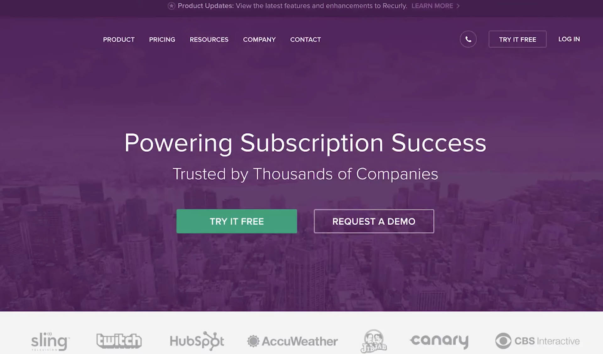
Here's a real-life example. This is a big company, the company's name is called Wreaker Lee. They managed subscriptions for other companies, they have software and sell software to other companies for other companies to manage their subscription billing. I took a screenshot of their home page, removed the logo in the upper left-hand corner, so there's no brand recognition. Let's take a look at their headline is “powering subscription success”, their sub-headline is “trusted by thousands of companies”.
There's a call to action “try it free” and “request a demo”. I felt that this headline was unclear.
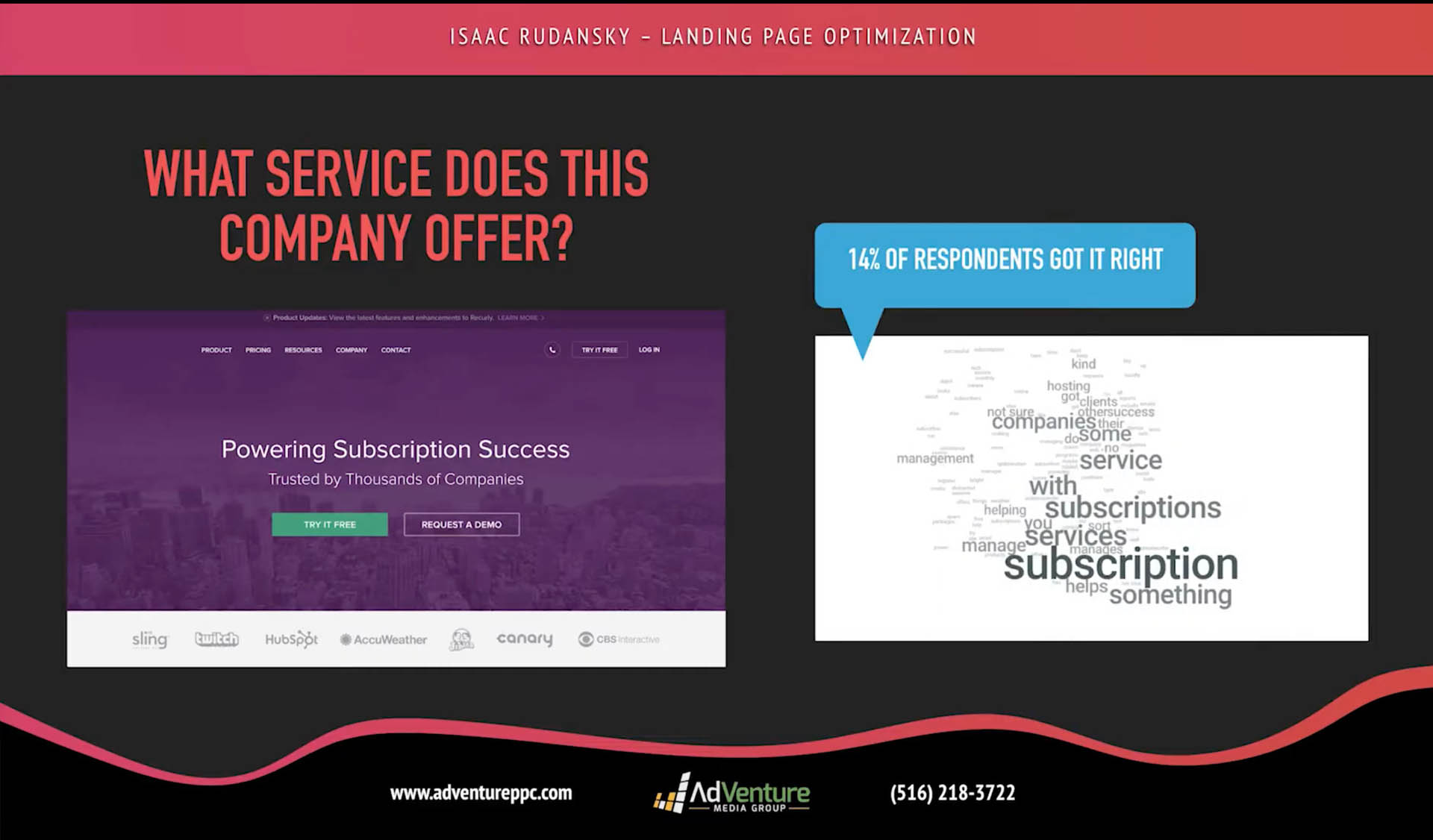
I asked 50 strangers a very simple question after showing them this image for 5 seconds: “what service does this company offer?” Very straightforward. Take a look at the results: 14% percent of respondents got it right, understood what this company did. A lot of people just “something to do with subscriptions” but let's face it - just saying that they do something with subscriptions is pretty arbitrary. Subscriptions could be a whole wide gamut of things. We were looking for managing subscription billing for other customers, for their customers offering subscription billing software. That's really what they do.
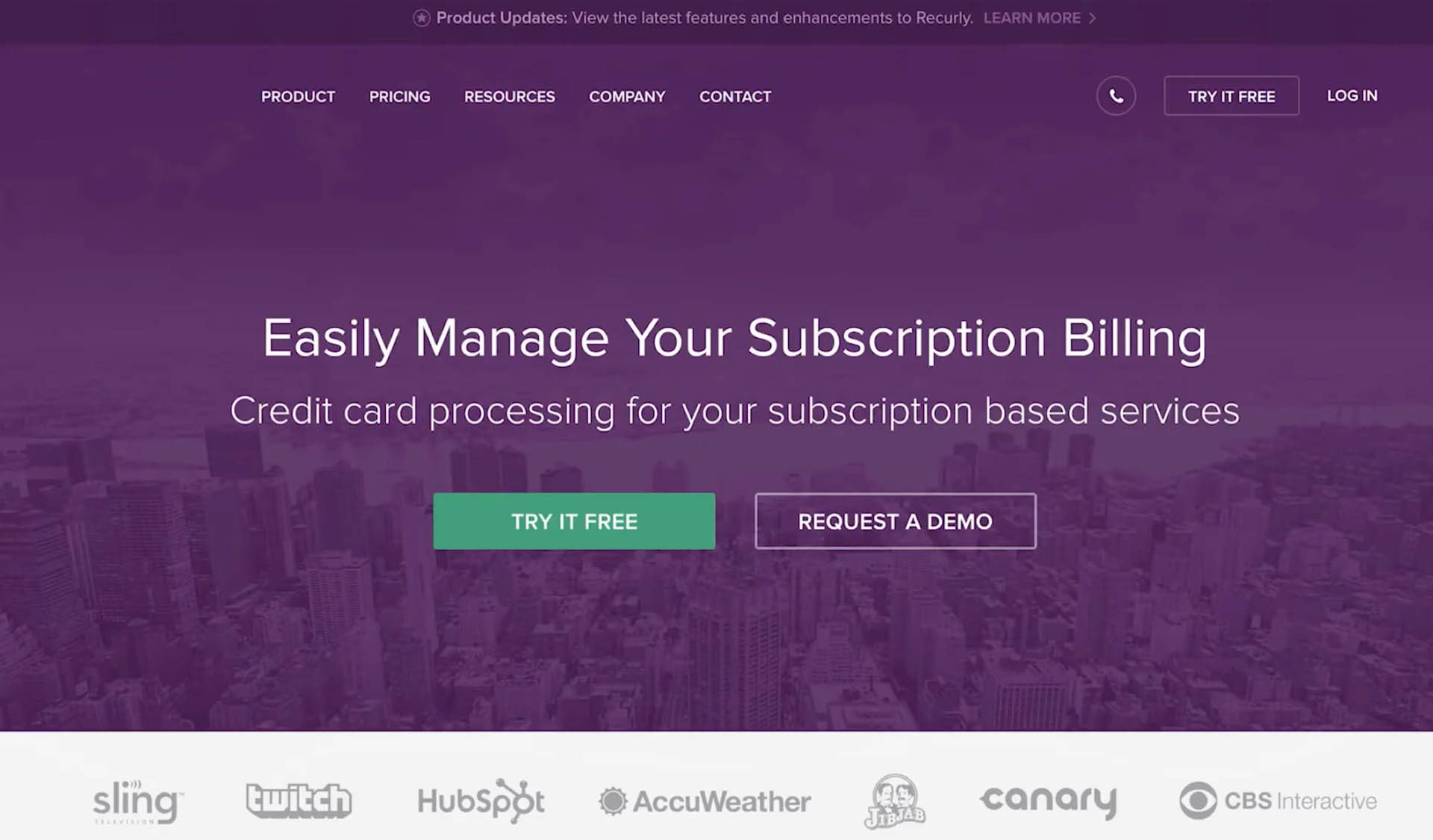
So I took the liberty to quickly create my own version of their homepage (I spent maybe a minute writing this headline and sub-headline). I'm not saying it's great, but I think it's an improvement. The headline now reads “easily manage your subscription billing you're talking to the customer.” “You giving over some clear messaging credit card processing for your subscription based services” - that's the sub headline. If I would have spent more time or collaborated with the people understood their business a little bit better, we probably could come up with a much better headline. If we all got together, we come up with something even better.
The background image is the same, everything is the same besides for the headline, the subheadline, and I asked 50 new people (not the same people as before, of course) the same exact question after showing them this image for just 5 seconds: “what service does this company offer?”. Very straightforward.
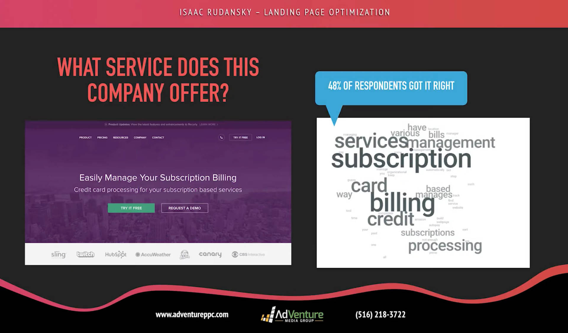
I'll take a look 48% of respondents got a right! “Managing subscription credit card processing for other companies”. Now, 48% is not great. It's not necessarily incredible. You want more than 48 percent of people to know what you do, the basic concept of your business within five seconds. But we tripled the recognition, the cognitive simplicity of the messaging by just simply writing a better headline, better subheading! And this is just a preview of what's to come of all the interesting tests you're going to see, of all the incredible psychological techniques we're going to learn about reciprocal concessions, cognitive dissonance theory and anchoring.
We're going to learn about how to apply those persuasion frameworks to effective landing page design. We're going to do all the stuff and see a lot more tests like this.
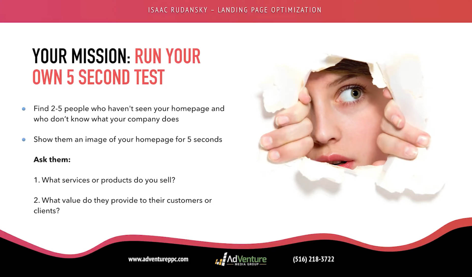
Now, to end off lecture one, it's exciting. I'm really pumped for this whole course. Your mission (if you choose to accept it): run your own five second test – very simple. Find two to five people who haven't seen your homepage and who don't know what your company does, they don't know what products you sell. Take a screenshot, show them an image of your homepage for just five seconds and remove it. If your company has a lot of brand recognition, remove the logo wherever that logo is, and ask them two very simple questions: what do you sell, what products or services do you sell and what is your main value proposition, what's in it for the customer, what are the benefits, the emotional and psychological payoffs of engaging with your services or buying your product.
Ask them those two simple questions. I think you'll find some pretty interesting results. Hopefully everyone will get it right, but it's an exercise to get yourself into the testing mindset, it's an exercise to help you step into the shoes of objective people. You're going to start getting a sense that not everybody sees your landing page, not everybody understands your message. You're not conveying to everybody what you think you're conveying to them, and people don't use your website the way you think they're going to use.
We're going to talk about that as well in the future chapters in much greater, detail but I think this is going to be a very exciting exercise for you to do, and please let me know the results that you get, because I'm really excited to see how you guys are interpreting this test and the type of results you're getting.
So with that we will conclude chapter one. Again, very, very excited about this course!