In UI/UX Design
How To Structure Your UX / UI Design Portfolios (2021) - read the full article about ui ux 2021, UI/UX Design and User interface and user experience design from CareerFoundry on Qualified.One

Youtube Blogger

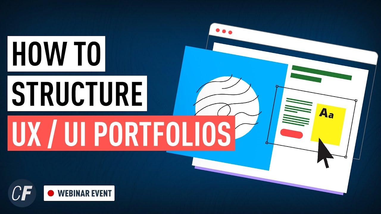
Are you in the process of building a UX or UI design portfolio in this video well give you some expert advice so you can properly structure your portfolio so it stands out to hiring managers this video is a snippet from one of our recent live events where Kim Steindel one of career foundry mentors details some of the key elements you need to consider when building out your UX or UI design portfolio if youre interested in more events like this check out our event page on our website and if you think UX and UI design might be for you check out one of our short courses in these areas the links are in the description below now lets dive in to find out what you need to structure your UX or UI design portfolio lets talk about the structure now um i already talked a little bit about that you can basically do whatever you want and that everything can be successful it just needs to be in context with a company but there are a few areas that we should implement in every portfolio because just by crunching numbers and just by looking at case studies and heat maps these things are most looked at and most effective so lets talk about these the very first thing is a hero image for those who dont know a hero image is basically the very first picture you see when you click on a case study on a website um yeah its its different for every single one but a lot of case studies dont have one which is a shame they just start right away with a problem statement or anything else but the hero image is the first thing a recruiter sees as well and it shows your design skills so you should typically feature some high fidelity wireframes on your hero image and the best way to do that is also to feature them on multiple devices if you only feature mobile screens but you want to work for companies that have both mobile and desktop or maybe iPad design requirements then a recruiter might look at this see mobile screens all over the place and they are thinking okay cool they can do mobile but can they talk i i dont know right and sometimes they dont have the the capacity to really look at this or the knowledge so a hero image is important every case study should have an error image and every case study should ideally include different devices so that they know how the designs look at next point summary you need to describe very early on what your project is all about the things that you need to describe here are the best things that you can describe here is the problem youre trying to solve with the app right why why does this app exist or why does this case study exist but also what you used and what you did in order to in order to tackle this case study so as a recruiter i have a bullet point list i know that there are terms on it and i can see A/B testing i can see high fidelity prototyping i can see customer journey mapping or user stories right and i need to find these as quickly as possible because i have 200 other applications to go through today and i cant spend 35 minutes on a single portfolio trying to find all of these keywords so we we want them to see these keywords very early on because then they have a peace of mind and they wont read the rest anyway because they dont understand it so they can spend the rest of the time looking at pictures so if they find their keywords right away and then look at the pictures and they like the pictures the chance of you getting the interview is really really high next thing consistency especially when case studies are a little bit longer its really easy to have them inconsistent we introduced new colors maybe we did our customer journey map in a different color than our user stories maybe we are using different fonts maybe we are using 10 or 12 different font sizes for different headlines that seems like a minor thing but it makes the case study look very chaotic for example if you have content that is left aligned for the first part of the case study and then content that is middle or right aligned for the rest of the case study maybe not everyone will be able to call out that this is an issue but it may leave a feeling of hey this doesnt look right so consistency is really important also when it comes to the language usage see a lot of people starting off with language usage in the present im doing i um im going to and then they are switching to i did or they are using in another past tense right so if you create something it needs to be consistent fourth point quality the main selling point of your portfolio will be the content that you feature so whenever you feature high fidelity wireframes or graphs user flows or anything else that could have high value the picture quality should be of high resolution your screens can be the best looking screens that the world has ever seen and you wont get an interview if they look blurry um usually what i found most effective in terms of size because you dont want them to to be too big because then the website never loads but the most effective thing in terms of size is downloading them in 4x so if youre in a design tool and you want to feature something 4x is is a great way to do that next ones high fidelity high fidelity screens perform better if they are found early on thats why we also put them in the hero image and at the end of the case study we know this because we tested it with heat maps so a heat map is a tool that shows you where visitors what visitors do on your website right so you can see where they glance over you can see where they spend the most time you can see where they have their mouse where they click and usually we find that whenever we have high fidelity screens that there is the most attention so always feature if possible high fidelity screens now that doesnt mean that you cant apply if you dont have them yet there is still a lot of um great jobs given to people without high fidelity screens because the company didnt need it but if your project can benefit from it then this will be a great way of pimping it up next thing language project-based language beats the personal learning language especially when people are new and a career switcher they dont want to well maybe they do want to but often the language that im seeing from people is more like personally focused personally learning focused and not so much focused on the project its more about i did user UX studies i did i did high fidelity wireframing but it would be better if you describe the project itself because then you can also give the context which is the last point so instead you should be writing high fidelity wireframes were created to establish a prototype that could be used for user testing a user persona was created in order to um combine all the needs and questions we got from interviews right so always try to have it more project related than personal related next point gives and videos moving images and small videos are the best thing ever as a recruiter because sometimes youre really bored going through these case studies because youre its a chore especially if youre not a designer yourself its not something that you like doing but if you have some gifs and videos often your attention is exactly there its fun to look at and not enough people are doing it you will find that a lot of great portfolios that are being featured in top 10 or top 15 lists one common nominator between almost all of them is moving images of videos in some way or form and we also know through heat maps again that this is very successful last thing context since every business has their own expectation of designers and their own roadmap and their own goals and wishes and pain points we should always try to give them the context of our thinking part of your first interview rounds will always be trying to understand your design decisions because otherwise its too easy to say yes or no if you disagree or agree with something for example if you say i do i i did user journeys and customer journey maps but the company has never heard of that or they never consider doing it then they may look at this and they say well this is not relevant for our job but if we give them the context we are telling them why we did these things even if they are not doing it even if they dont like it even if they dont have any budget for it they can still understand why it was relevant for that different part of your case study and it will really help them to understand your thinking as a designer which in return makes it easier to invite you for an interview so these eight points are absolutely something that you should implement when you have the chance because it will skyrocket your chances of getting to the first interview stage so i hope you enjoyed watching this webinar snippet if you have any questions about structuring your UX or UI design portfolio let us know in the comments also let us know what was your main takeaway from this video if you want to see more design events like this check out our events page on carrierfoundry.com subscribe to our youtube channel for more weekly videos like this thanks so much for watching see you next time you
CareerFoundry: How To Structure Your UX / UI Design Portfolios (2021) - UI/UX Design

