
In Web design
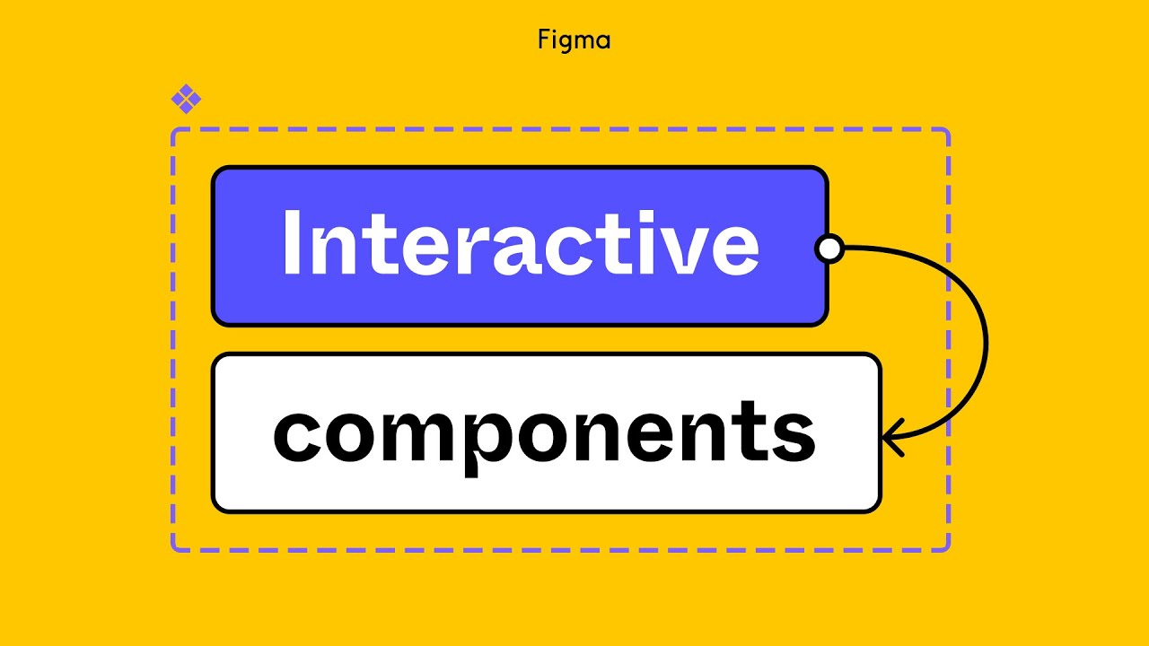
Figma tutorial: Interactive components - read the full article about Figma, Web design and from Figma on Qualified.One

Youtube Blogger
In our Variants video, we showed how to create different states for a checkbox, such as checked and unchecked. But what if we want to be able to check and uncheck the boxes in a prototype? And what if our design requires multiple checkboxes like in a to-do list? Interactive components is a powerful feature that allows you to define prototyping connections between variants in a component set, such as an auto layout button shifting between different states. We can publish and reuse the variants in our designs, and their instances inherit those interactions by default without our need to recreate new interactions.
Another designer could even reuse that asset in a different file, override some properties like swapping the icon and changing the text, and the same interactions will be preserved.
This also means that instead of creating dozens of frames to account for all possible combinations of interactions as our design scale, we only need one frame.
This makes building and changing prototypes more efficient in the future, so if interactions change we can publish the updates to the library to keep our designs consistent across the company.
In this video, well show you the basics of how to create interactive components and use them in both simple and complex designs.
If you havent already, use the resources linked in the video description to learn about variants.
This will be an important foundation for creating interactive components.
If you want to explore additional examples, check out what other users from the Figma community have created. To start off, we want to use the checkbox component set from the variants tutorial and use them as part of our search filter on our travel website, Tripma. You can grab a copy of the Tripma community file in the description below to follow along. Theyll need some labels, so well update the variants with some default text. Now, lets make the checkboxes interactive, so that theyll change between checked and unchecked when clicked.
We can do this by creating prototyping connections within our component set.
First, well click on the prototyping panel.
Then, well click and hold the small circle on the unchecked variant and drag our cursor to the checked one.
We just created a prototyping connection! We also want to be able to uncheck boxes, so well drag a connection noodle back to the checked variant.
Note that when we create interactions between variants, the action defaults to "change to" as shown in the interaction details panel.
It tells the object to change to a different variant within the same component set upon a specific trigger.
"Change to" is an action available only to variants for creating interactive components, so will be disabled for frames and regular components.
Now that we have our interactive components set up, lets place an instance into a frame, and duplicate it a few times.
Well open up presentation view to see how our interactive components are working. We can now click on any combination of boxes to check and uncheck them, and we only needed to create a single frame.
Looking great! Lets go back to our file and use what we just created as a drop down menu for our search filter.
Well override the text on each instance, and update the styling of the drop down menu.
Well turn the entire thing into a component and grab an instance of it to use in our flight search results page.
Lets create a prototype connection, so that every time we click on "seat class," the drop down menu will open as an overlay and close when we click outside of it.
Lets hit play to view our prototype.
Our interactive components work just like before, and youll see that our text overrides are preserved seamlessly while we switch between the checkbox states.
Tip: text isnt the only property you can override.
You can override properties like color or stroke, change the interactions, or add interactions.
Interactive components can also be used with smart animate.
Lets take a look at how this would work.
We have a toggle component set with two variants, toggle on and toggle off, both with labels and we want to create a click interaction between them.
Lets click on the prototype tab in the right sidebar and drag a noodle from "toggle on" to "toggle off." We also want the slider to move and colors to gradually fade between one another as this happens.
so lets open up the interaction details panel and change its animation to "Smart animate," change its transition to "Ease out," and shorten the duration.
Well repeat these same steps for toggle off to toggle on.
Now lets place this component in a frame and view it in presentation view.
Just like the check boxes we can easily change the toggle variants.
Smart animate slides the switch back and forth making the toggle look more realistic and easier to follow.
Now lets see how interactive components can be used on a large scale in one of our production design files.
We need an interactive seat selector for users to customize their flight accommodations.
We have a component set with a different seat variants well use for the seat selector.
The component set contains two variant properties weve labeled "state" and "class." The class property includes "economy" and "business." The business variants are larger to indicate a more spacious seat.
The states include the values: Available: or the seats the user can pick from, Hover: a feedback indicator when the cursor sits or passes over a seat, Selected: which seats the user has chosen, and, Unavailable: seats the user cant choose because theyve been previously booked by another passenger, We want to create separate interactions between the economy variants and between the business variants.
First, lets start with the available economy variant.
Go to the prototyping tab, and drag a connection noodle from "Available" to "Hover." Well go to the interaction details panel, and change the action to "while hovering." Next, we want to be able to select a seat after hovering over it, so well connect the "hover" variant to "selected" and set the action to "on click." Lastly, we want to be able to deselect a seat if we change our minds.
So well connect the "selected" variant to the "available" variant, and set the action to "on click." We dont need to create any interactions with the "unavailable" variant, since these seats are already taken and cant be selected.
Lets take the steps we did for the economy class variants and apply the same interactions to the business class variants.
Once were done, lets take a look at how these interactive components will work in a prototype.
Weve built out a seat selector with business class at the front of the plane and economy filling the rest of the plane.
When we interact with them in presentation view, well see that hovering over available seats will change them to the hover state, clicking will change them to the selected state, and clicking again will deselect and change it back to the available state.
If were traveling with a buddy, we might select two seats right next to each other toward the back of the plane, but then change our minds and decide to upgrade to business.
Or maybe were traveling with a large extended family and need to figure out how to keep the group close during the long flight.
With interactive components, we define prototype connections between variants just once, freeing us and other collaborators to use the assets and designs without needing to drag any additional noodles.
The examples in this video are just a few ways you can use interactive components.
For additional powerful examples, check out the community files linked in the description.
And, be sure to like and subscribe to keep up to date on the latest product and community news.
Thanks for watching!
Figma: Figma tutorial: Interactive components - Web design