In Web design
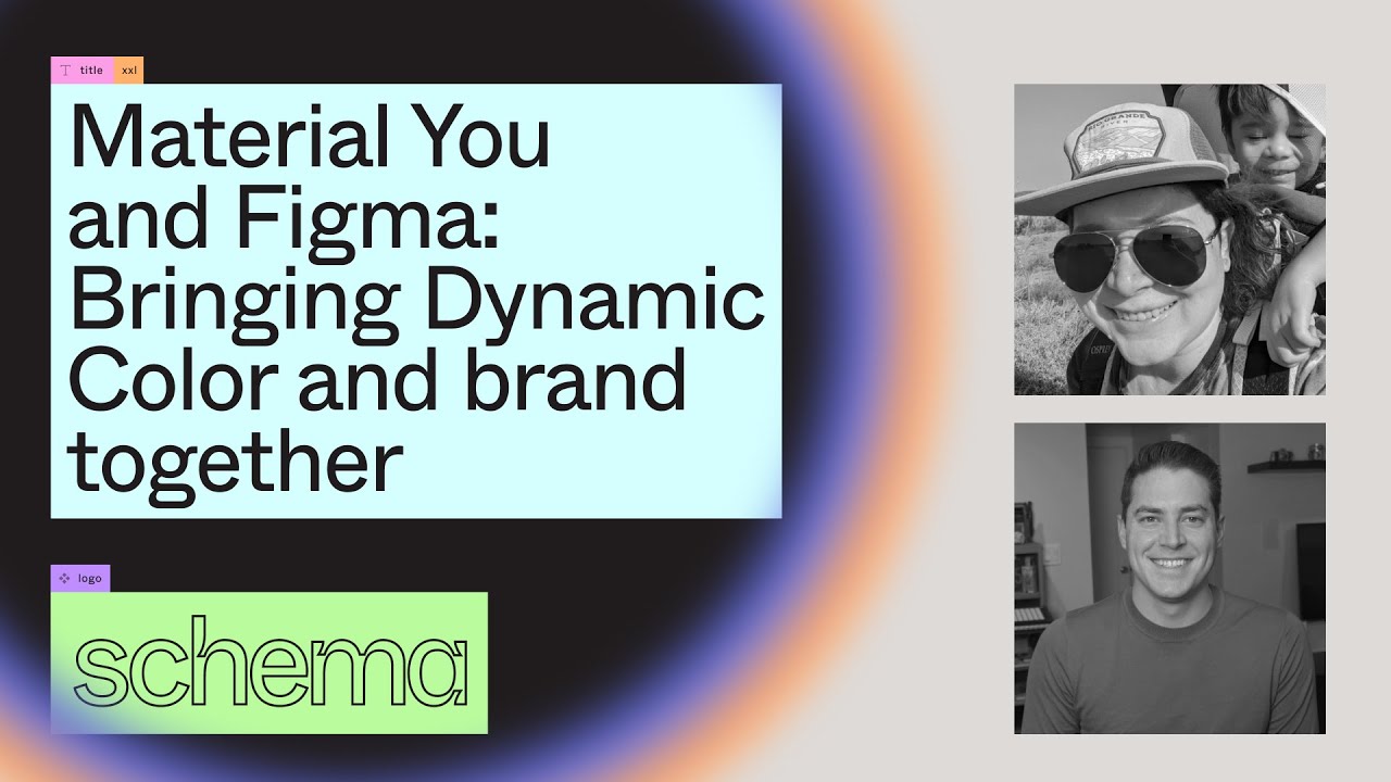
Material You & Figma: Bringing Dynamic Color & brand together - Rody Davis, Ivy Knight (Schema 2021) - read the full article about Figma, Web design and from Figma on Qualified.One

Youtube Blogger

[Rody] Hi Im Rody Davis, a Developer Advocate for Material Design.
[Ivy] And Im Ivy Knight, a Designer Advocate for Material Design.
[Rody] Our team focuses on helping the community build beautifully with Material Design by providing resources, tooling and examples.
[Ivy] Material Design is a design system created by Google backed by open source code to help teams build high quality, digital experiences for Android flutter and the web. It includes design guidelines, and an extensive library of components that can be customized to meet your style and brand needs.
Since its formation, Material Design has relied on color to express hierarchy and communicate meaning in UI.
A primary color appeared more frequently in an app, while secondary colors were used to accent key parts of your UI.
Throughout the years, weve expanded on colors to be more expressive.
Building off Material Designs primary and secondary colors, Material Design 3 introduces tertiary and container colors to express a harmonious set of tonal palettes across your UI the check for accessibility.
This year at Google I/O, we showed the bold and expressive evolution of Material Design.
Were excited to be here to show you how to implement Material You in your digital experiences, and the tooling we created to support designers and developers with dynamic color.
Color is a foundational element in any design system.
Material You reimagines color as a more individualized experience.
Dynamic color lets personal devices feel personal, and we believe design systems should be just as personal as the devices they appear on.
By incorporating personal preferences in the UI of your product, users have more control than ever over their devices.
With dynamic color and Material 3 color schemes, your apps color automatically adapt and integrate with user colors by letting their wallpaper influences the apps color scheme We understand this is a new way of thinking of colors for your app The digital products we create can now reflect trends in our real life products that adopt more personal colors, patterns and materials.
Dynamic color embraces the need for color to reflect an apps design sensibility while also honoring an individuals needs and preferences.
Its the key part of Material You, in which an algorithm derives colors from a users wallpaper to be applied to their apps and system UI.
Since color schemes are defined by tonality, rather than a hue or a hex value, the system of tonal palettes essential to making any color scheme accessible by default.
Using a minimum 60 luminance spread in color pairings, color combinations provide enough contrast to ensure accessibility standards.
For example, these colors may have a different hue to them but the tone is very similar making contrast inaccessible, especially for those with certain color blindness and at the bottom here, heres the same concept applied to a fab and with the corrected versions to the right of them.
The color system automatically assigns the appropriate hue, chroma and tonal values for all roles.
How does this all work? Starting with the users wallpaper, a source color is extracted and extrapolated into five key colors.
Each color is then interpreted into a tonal palette of 13 tones and a selection of colors from the tonal palettes are then slotted to a group of specific roles and values that map to components called a scheme.
Color schemes can be considered a cohesive group of relative tones rather than a fixed group of constant values.
Light and dark schemes are generated for each Semantic colors such as air color is also slotted automatically.
Each color roll required for the UI is derived from the key colors using this process, ensuring proper contrast between elements.
These roles are what you will map to in your designs.
You may be familiar with the current 12 color slots in Material Design, like primary and on primary.
With Material Design 3 or M3, we introduce a new tonal palette and roles and schemes.
Container and its respective on container used for UI elements that do not need as much emphasis as their non-container counterparts and a new tonal palette, tertiary, used to bring broader color expression in your product.
[Rody] But how do we make this all possible? Well, its through design tokens and this allows us to change role assignment that cascade consistently.
Building with values that change at runtime means that we need to reference colors by their semantic meaning, instead of hard-coded values.
Building off of the Material Design to color roles, tokens provide global styling slots as well as a token being able to have multiple types paired with a value or referencing another token.
With Material 3, we now have the concept of palette reference and system tokens.
These color rolls you build with are the system tokens and they can inherit from the reference tokens, which we are introducing with called tonal palettes and these include primary, secondary, tertiary, neutral, neutral variant, and error Design tokens enable flexibility and consistency across a product by allowing designers to assign an elements color role in a UI, rather than a set value which then be handed off to a developer to implement.
Design tokens can be generated, saving the developer and designer time by agreeing on a source of truth.
A developer can then reference this file and map to the theming object, for example in compose.
If these tokens change in code, this can now easily be shared back with the designer by having the values updated in their design mocks Swapping colors and typography hard-coded values with tokens should make it easier for you to iterate on your designs.
Colors in a tonal palette are mapped to light or dark scheme through design tokens.
The color scheme values can be overridden to inherit custom colors, or just the reference tokens themselves.
User generated color utilizes these color mappings to tokens to create dynamic and expressive UIs.
When the system colors change at run time, they will update the tonal palettes which then update the color schemes, which is what you use to map to your components in your theme It is important to use the right color roles for the corresponding component to ensure accessibility and continuity.
We needed a way for app creators to explore dynamic color, and we understand that the color system via design tokens.
So we built a tool.
And were so happy to introduce the Material Theme Builder.
A tool to help designers and developers create custom color schemes, and visualize dynamic color in their UI.
We knew introducing dynamic color brought on the new challenge in how we thought about and approach color in our designs.
We wanted to provide designers and developers hands-on tools to explore user-generated dynamic color.
This tool can help visualize how it may be reflected in their UI, and can be integrated into their existing workflows.
We built it for Figma and the web.
Material Theme Builder creates Material Design tokens as Figma styles.
These tokens are automatically mapped to our components within our Material Design Kit, and can easily be mapped to your custom elements within your Figma designs.
As Design System Advocates, it was important for tooling to act as educational guidance. Showing the process on how a source color generates tonal palettes, and how these mapped to color schemes helps creators understand the process and magic powering it all.
We were developing this tool in parallel with guidance.
We tested it early and often with internal teams, and this led to fast iterations based on feedback.
In its early inception, the tool was primarily focused on visualizing dynamic color but the complexity of dynamic color is that the generated color scheme doesnt paint a complete picture of the various ways your UI color can change.
It became clear that managing themes was an absolute necessity.
In order to make iteration easy for designers, we created a way to swap themes.
By using the same token prefix, creators are able to swap easily between various themes.
Each theme is validated to check for missing tokens on launch, which meant being able to use the plugin to test and create faster themes within our design mocks.
But all the tokens have a structured format, which means that we get to preserve the metadata by switching themes.
This also allows for toggling between light and dark themes as well.
This also means that managing designs consisting of multiple brand themes was a breeze.
Theres no more manually diving into the style pickers, setting colors, and this now can be done by just swapping to a new theme, hitting swap and now the plugin will be recognized because of the Material Design tokens.
We wanted to make generating from an image easy for designers, so we store the image as a color style and load it in on launch.
Alright lets see all this in action.
Jumping into our Figma file with the Material Theme Builder open.
We can open it up and connect it to our design kit components.
Here we have the plugin, and were just going to look and see what the default canvas is outputted.
Were going to select an image, and have it run through the algorithm.
With an image selected, it updates the image style token and generates the new colors on the canvas.
Here we can see the colors, key colors that are generated as well as the light and dark schemes from the tonal palettes, and the surfaces.
The plugin works with our design kit allowing you to select any arbitrary selection, and click on swap to have it migrate to the tokens of your current selected theme.
You can quickly iterate on these colors by choosing new images, which well do now.
This makes it really easy to iterate on your designs, while having a single set of tokens and new images that are stored in those seed values.
Here we can see all the colors change, but our moc stays the same.
So beyond visualizing dynamic color, we need a way for designers and developers to migrate to Material 3s new color system.
In this new color system, we have an entire scheme thats derived with tokens.
So here, we can update our seed color to generate these new color schemes with this new shuffle button.
This allows us to check and see all the variety of ways that our UI may look on a users device.
Even though that colors are accessible by default, this allows you to make sure that your designs still look good.
Here we can just click a couple different seed colors, and see how it looks.
The seed color option is really nice to be able to really quickly iterate on these designs.
You can also pick any color in the custom color picker as well.
Our new color system added and removed color tokens, which required mapping across our material components.
We added the ability of building with a custom theme, and this theme can reflect your brand style and you can set it as a foundation of your apps UI color Here we can just add a new theme, and switch to it in the dropdown.
Moving over we can see that it swapped out the tokens for our branded theme, and now we can choose our brand colors, starting with our primary.
The primary value input will also create and act as a seed color, updating the other key colors cascading down.
Now we can choose our secondary and tertiary colors along with our brand.
Using the Material Theme Builder, this provides a branded color scheme, and make sure that its harmonious and accessible by default.
These still generate the full tonal palettes, which you can use and reference in your designs.
Ill update the secondary and tertiary inputs with my brand colors, and then ill override the key color.
This will interpret into tonal palettes, which generate the light and dark scheme.
This custom scheme can be used on Android versions 11 or below that do not have dynamic color available.
If you have semantic colors, they dont have to be left out, and they will be included as additional colors ready to be implemented.
This means that you can use dynamic color for your apps main theme, and include extended colors for semantics or even brand colors.
We include in the description, accessibility checks, to make sure that your colors will look good on a variety of different situations.
You can update the color live in the color picker, and it will update these accessibility ratings.
Here, we have another example of working with our design kit.
we can select it and make sure that we are mapped to it.
We suggest keeping the generated colors that you have to ensure flexibility, the styles can be updated to reflect not only in Figma but can be exported next time you open the plugin.
Building off Figma styles, token and color system can be integrated with custom components and branding styles with ease for cohesive color story and weve only painted in the picture for color here, but dont forget about typography.
We highly encourage you to express your brand through type, and Material Design tokens are here to help.
A baseline type scale in Roboto is generated along with the color scheme, and they are connected to styles with the appropriate Material Design tokens ready to be customized.
I highly recommend anything from Google Fonts, which can easily be implemented in your Android app.
So lets see this in action.
So one more time, lets go with the design mocks.
Weve now iterated through multiple mocks to visualize how dynamic color will we impact the UI.
Weve created a custom theme, and have wonderful semantics of how the colors are used, plus added custom type.
and theyre all ready to be shared with your development team.
We wanted to make it easy and allowing you to easily migrate, so we introduced code export.
This provides developers an easy access to be able to export the design tokens and integrate it in their apps today.
This is made to work with our current versions of Material Components.
So, in conclusion, both dynamic and branded themes with Material You allow you to build beautiful, expressive apps with color that reflects users choice, and tokens that help the developers and designers collaborate.
We are so excited to see what you build.
We will be releasing the Material Theme Builder as an update to the Material Design Kit at this years Android Developer Summit.
Keep following us on Twitter for more information, and follow us @rodydavis and @margeeta. Thank you!
Figma: Material You & Figma: Bringing Dynamic Color & brand together - Rody Davis, Ivy Knight (Schema 2021) - Web design

