
In Web design
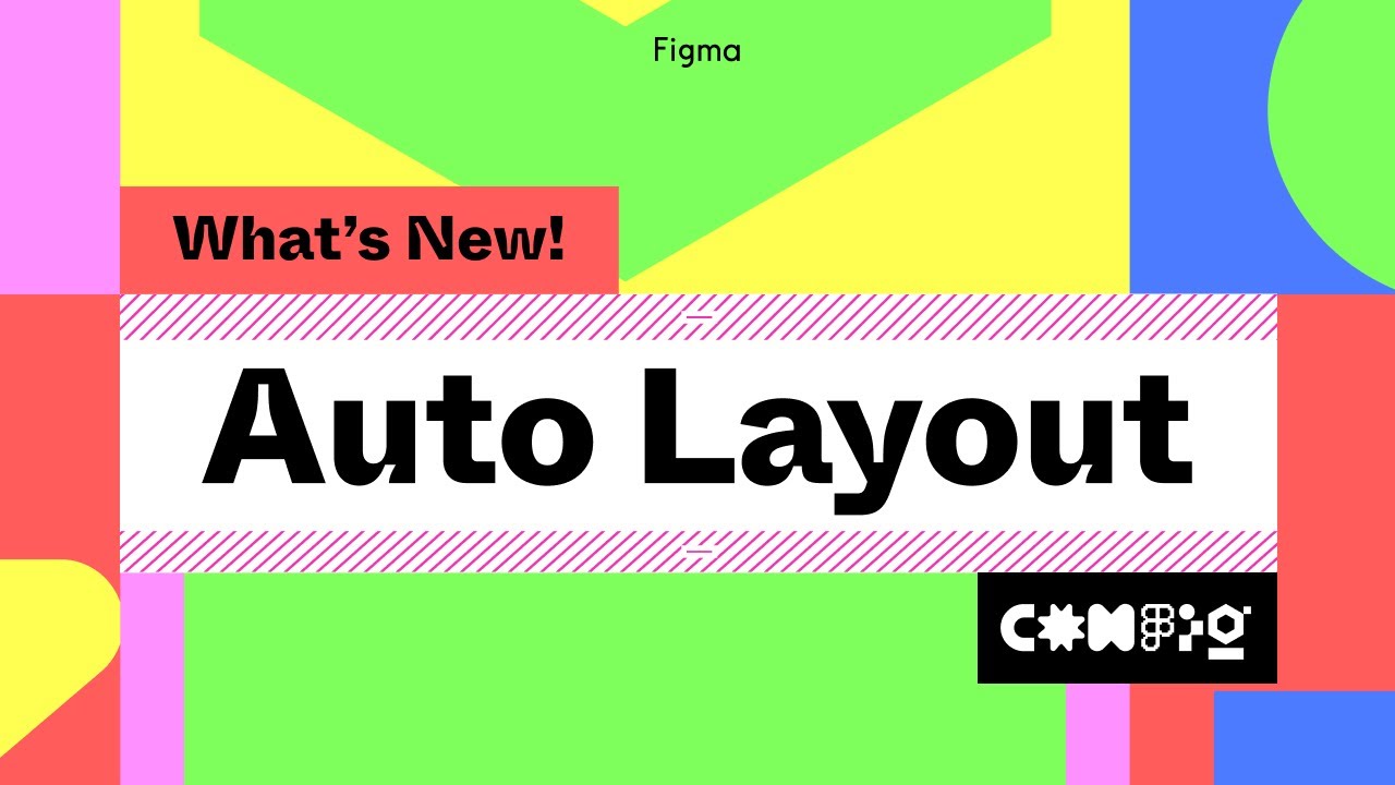
Figma tutorial: What’s new in Auto layout #Config2022 - read the full article about Figma, Web design and from Figma on Qualified.One

Youtube Blogger
auto layout is a powerful and flexible feature in figma that allows you to create designs that respond to content changes and layout size were excited to announce that auto layout is even more powerful than before with new capabilities like negative spacing absolute positioning text baseline alignment canvas controls and more weve also freshened up a few things in the right sidebar to speed up your auto layout design process if youre new to auto layout or need a refresher on how auto layout works check out previous tutorials linked in the description below in those tutorials the interface will look slightly different and wont include updates from this video but the underlying principles of auto layout are the same in this video well be creating a card component for a task management app well walk you through whats new and whats changed in auto layout to follow along and for additional resources check out our auto layout playground file linked in the description below we want our card to show the following information a title for the task name avatars to show contributors of the task a day counter to track the amount of time until the task is due a chevron to expand the task cards details and a bonus element will reveal toward the end lets start by creating a task name well create a new text layer with some dummy text and increase the font size and weight next lets create the contributors by using a stack of avatars weve already created a few but you can find the final asset in the playground file linked below lets select the contributors and hit shift a to place them inside an auto layout frame before we move on check out the layers panel for an update to auto layouts layer ordering in the past layers in an auto layout frame were placed in the opposite order from what was shown on canvas weve updated the layer order to match what you see on the canvas for easier organization and navigation lets get back to building our task card we want the contributors to flow horizontally so well change the auto layout direction from vertical to horizontal we also want them to overlap one another this is where our new feature negative spacing comes in find the space between input box in the right sidebar and type in a negative value the avatars are now stacking with the leftmost contributor at the bottom and the rightmost contributor at the top but what if we want to switch the stacking order so that the leftmost avatar is at the top to do this we have our next new feature canvas stacking order with the contributor stack selected go to the right side bar and click the three dot icon for advanced layout options use the drop down next to canvas stacking and select first on top nice note that when the stacking order changes the order of layers in the layers panel stays the same canvas stacking is solely a visual change that happens on the canvas the next element we need for our task card is a day counter to show how much time we have left to complete the task lets bring in our pre-made clock icon which you can grab from the playground file next well create a text layer for the countdown then update a few properties well select the icon and text layer and add auto layout right now the text layer and icon are looking unaligned this is because theyre aligned from their vertical centers to improve this we want to align their baselines instead this brings us to our next new feature text baseline alignment aligning text baselines can be crucial when creating pixel perfect designs especially when using varying font sizes to indicate priority of information with the auto layout frame selected go to advanced layout settings and click the check mark next to text baseline alignment and voila theyre aligned now lets add our chevron which will be used to collapse and expand the task cards details well find our chevron from the assets panel and drag it onto the canvas great we have enough elements to start putting our test card together place the contributors and day counter next to each other and add auto layout to create a footer then place it underneath the task name select both items and add another dimension of auto layout press enter to select both items again and go to the right sidebar to change its horizontal resizing youll find that the resizing options are no longer in the resizing section because these options have moved instead youll find them just below the width and height inputs toward the top of the panel lets go ahead and change horizontal resizing to fill container next we want to give everything some breathing room but lets add a fill to the card first so we can better see what were working with now select and hover over the card and pink handles will appear similar to the handles in smart selection these pink handles are new on canvas controls to change auto layout padding and spacing there are two ways to use these controls you can click and drag the pink handles to increase or decrease the padding or spacing or click the handles to open an input box and enter a specific number lets try both of these click the pink handle below the task name and enter a number to change the spacing now lets try clicking and dragging one of the pink handles along the perimeter of the card to change the padding we want the padding to be the same on all four sides so well hold shift option for mac or shift alt for windows while clicking and dragging if you prefer to change spacing and padding from the right sidebar you still can weve updated the padding and alignment controls to make it quicker and easier to use the top and bottom padding settings are now decoupled from the left and right padding you can still use commas to input individual padding or click the independent padding icon to separate all four sides and input a different number for each side if you want to set padding on all four sides at once hold command for mac or control for windows and click into any padding box enter one value to set the same padding on all sides or enter padding values using css syntax but wait where will the chevron go we want it in the top right corner of the card but it needs to sit independently from the rest of the cards auto layout flow this is where our new feature absolute position comes in absolute position allows objects to be removed from the auto layout flow while remaining in the auto layout frame much like absolute position in css you can place these objects exactly where you want relative to the parent container you can also apply constraints to determine how they respond when the auto layout frame resizes lets drag the chevron into the task card and youll see its siblings shift to accommodate the chevron into the flow to change that click the absolute position button in the right sidebar notice how its siblings shift again the chevron is excluded from the auto layout flow and ignored by its siblings lets place the chevron exactly where we want it and set its constraints to top and right great the chevron is looking too close to the task name though these two layers are overlapping because of the chevrons absolute position how can we solve this we could add breaks in our text but if we want to resize the card width-wise the task name wont resize with it instead lets place the task name in its own auto layout frame and increase the padding on the right well set the rest of the padding sides to zero then update the frames vertical resizing to hug contents and horizontal to fill container tip double-click the bounding box of an auto layout frame or auto layout contents to change its resizing to hug contents for example double-clicking the top or bottom of the bounding box will set vertical resizing to hug contents double-clicking the left or right sides will do the same for horizontal resizing to set resizing to fill container double-click while holding option for mac or alt for windows you can use these shortcuts on text layers within auto layout frames as well but youll find that the behavior is slightly different as theyre directly influenced by text resizing properties such as auto height auto width and fixed size to learn more about auto layouts resizing concepts check out our previous auto layout videos once the frames resizing properties are set press enter to select the text layer and go to the right sidebar to change horizontal resizing to fill container and vertical to hug contents now no matter what we update the task name to it wont come too close or overlap with the chevron lets update the rest of the cards resizing and spacing properties to make sure everything moves and resizes the way we want for the footer set vertical resizing to hug contents and spacing mode to space between tip click the alignment box and press x to toggle spacing mode between packed and space between you can also use the advanced layout settings to toggle this lastly update the parent container of the card set horizontal resizing to fixed vertical resizing to hug contents and spacing mode to packed now the card can influence the content horizontally when we resize it and be influenced vertically by its children with everything in its place lets add some style to our card by updating the stroke drop shadow and border radius looks like someone dropped a comment in her file while we were working lets check it out a designer left feedback that the contributor stack looks busy and inconsistent with the card style lets create a simplified version to try in our design select the main component and add a new variant remove the shadow change the strokes color and set stroke alignment to outside well name this variant simplified and switch the contributors in our card to this new variant i like the simplified version but the contributors are overflowing beyond its parents bounding box this is because the outside strokes arent accounted for when calculating the size of the objects which can cause issues in the developer handoff process so lets change how strokes take up space select the contributor stack and go to advanced layout settings open the drop down next to strokes and select included in layout youll see that the frame resized and the contributor shifted since space between is now measured from the outside edges of the strokes because of this the contributors have spread out even though the space between value hasnt changed lets update the value to pack them in closer to one another with strokes accounted for in the layout our design now more accurately represents how css renders borders this ensures visual parity in the design to code process our card is looking great were just missing one more thing as a bonus we want to add a category indicator that shows what category the task belongs to itll sit on the left border of the task card and vertically resize when the task name gets taller or shorter can you guess how we might do this first lets create a tall and thin rectangle about 6 pixels wide and 48 pixels tall to match the current height of the task name well round its edges using border radius and update its color next drag the indicator into the card and enable absolute position vertically center the indicator with the task name and update its constraints to top and bottom and left now whenever the task name grows or shrinks vertically the task card resizes and thus causes the indicator to resize as well were all done creating our task card from here we can turn our task card into a component and create a few variations for a component set well place a few instances inside an auto layout frame set the cards horizontal resizing to fill container and use it for the interface of our task management mobile app weve explored a few ways to use the new auto layout features how will you use them let us know what youre creating and what questions you have in the comments below at figma were always improving our product to empower you to do your best work auto layout will continue to grow so be sure to like and subscribe to keep up to date with the latest product and community news thanks for watching
Figma: Figma tutorial: What’s new in Auto layout #Config2022 - Web design