
Some details
",When the final brand strategy was presented to us, we could not believe how incredible the final product looked.", – Niels Buksik, CEO &, Founder
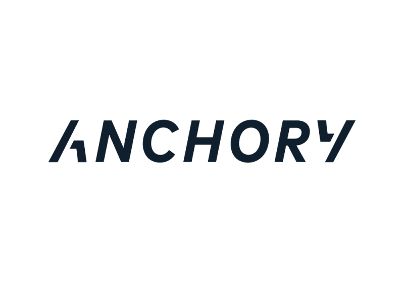
ANCHORY is a trust-invoking name that communicates the brand',s mission and strategy of offering financial advice to athletic families. The word anchor describes a person that can be relied on for support, stability, or security. Since we lead with
knowledge and guidance we leaned on the word advisory. The name ANCHORY quickly became a brand that embodies what it provides: specialized financial guidance you can depend on.The brand identity design for ANCHORY is simple yet powerful. A custom italic typeface was created to showcase forward movement and speed: a nod to the acceleration of your finances, the athletic nature of our clients, and our future-forward mindset. The letterforms A &, Y are the exact same shape, flipped to tell the story of 360° financial advice from beginning to end. A deep navy blue was chosen for its symbolism of importance, confidence, power, and authority, as well as intelligence, stability, unity.