
Some details
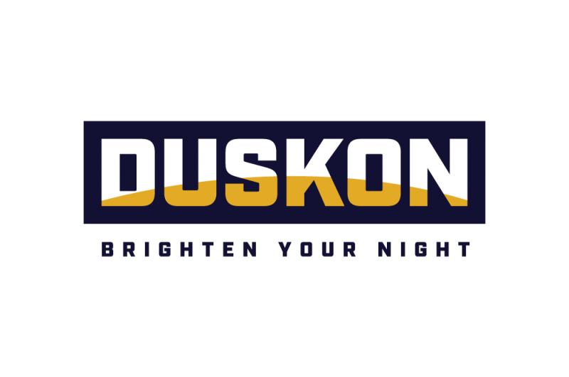
We were tasked with creating a name that had to be snappy, easy to say, spell and recall, yet, given the hardware space, it also needed to have a robust, industrial feel to it. Being an outdoor-only brand, we set out to showcase the timeframe in which their products shine: from ',dusk on', – and so the brand name was born. Sounding industrial at first, once the meaning is revealed in the minds of the consumer, it turns into an
approachable brand in an instant, exactly what the client envisioned based on the brand strategy.The DUSKON identity was created with smart simplicity at its core. A strong industrial typeface represents the reliability and durability of the lighting products. A deep purple was chosen over black to show the brand',s personality of friend (and mother). The yellow arch within the typeface represents the setting sun to showcase the time within which the products are best used – from dusk on – while also celebrating the name. The visual treatment further strengthens the brand',s core reason for being, and its tagline: to brighten your night.