
Some details
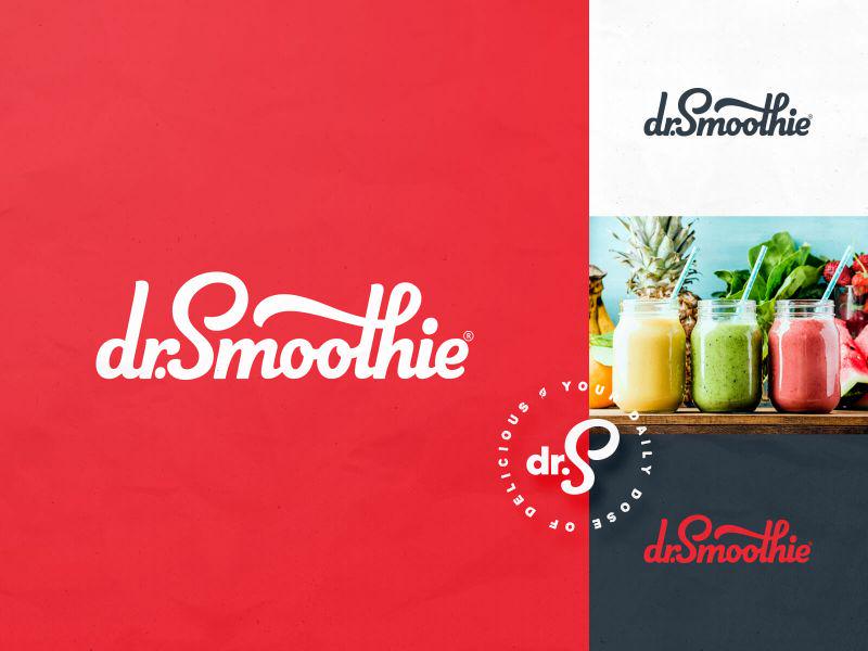
We worked with the Dr. Smoothie brand of Bevolution Group to refresh their logo of 20+ years and develop all new packaging for their 6 different product lines. When it came to the logo and visual identity, we knew we wanted to stay with the color red and within the script family for type in order to take advantage of the brand equity that had been built in the marketplace for the past 20 years. We also knew the brand deserved
custom handlettering, not a pre-built font.One of the primary drivers for how the refreshed brand would look and feel was the Brand Archetype of Explorer. Throughout our discovery process, we collectively decided the Explorer persona best represented the ethos of the brand: adventurous, resilient, upbeat, non-conformist and independent. This proved to be a cornerstone of our voice and design decisions throughout the project.