In Mobile App Development
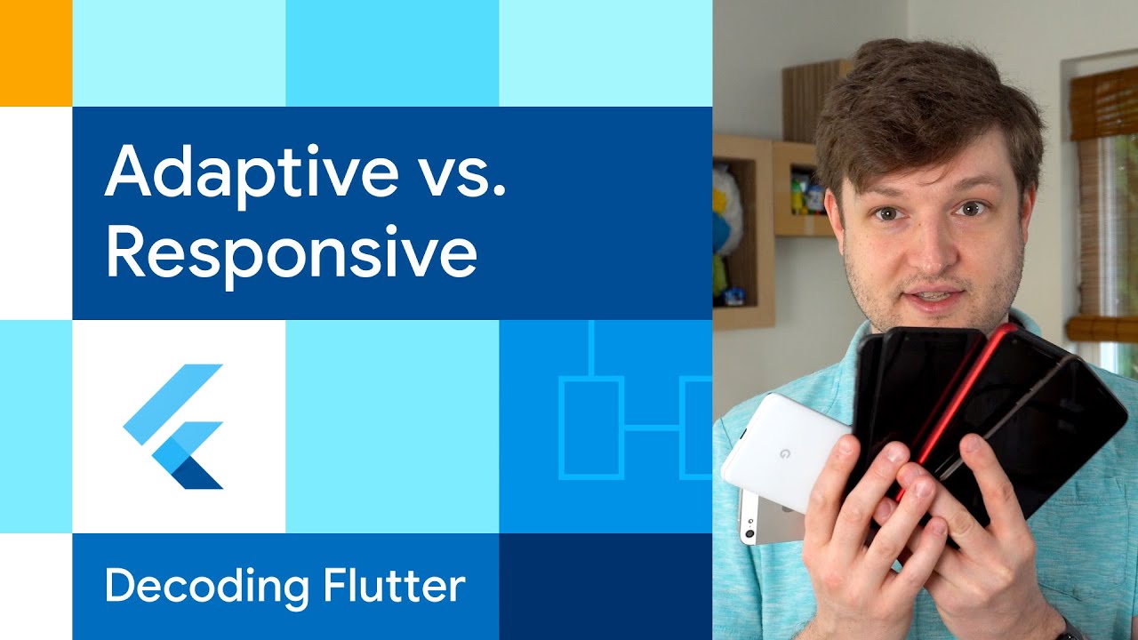
Adaptive vs. Responsive | Decoding Flutter - read the full article about Flutter, Mobile App Development and Native and cross-platform solutions from Flutter on Qualified.One

Youtube Blogger

[MUSIC PLAYING] SPEAKER: There you are, happily writing an iOS app, when bam! Someone has the audacity to request an Android version.
OK, thats fine.
Youre using Flutter.
Just change the build target.
Whew, whoa, and now someone wants a web version in Windows, Mac? So you can just rebuild the same app on each platform and call it good, yeah? Well, wait, there might be some other things to consider.
Like, even though screens are everywhere, some of them might be, whew, different sizes.
When I first learned programming, the tool I loved to use, much to the dismay of my early instructors, was the simple if statements.
After all, why not? Why shouldnt I keep using it? Here, we could just toss in an if else tree for every combination of screen size and platform we need to account for.
Unfortunately, this gets hard to maintain well before the animation to my left finishes.
And the reason is that this combines two concepts.
How much space do we have on our screen? And what is the platform able to do? These are the two ideas of adaptive and responsive.
With adaptive, I mean that an app is able to adapt to the capabilities that the platform is able to provide.
For example, devices not only have screens, but they typically have other things too.
Say you wanted to get the users location.
Many devices these days have GPS antenna or some other API service that we can use to get a set of coordinates.
This is often some kind of black box.
You ask for a location and you get the details you need.
And itd be lovely if all computing platforms in existence had the same get location API.
But alas, this box is not quite that opaque.
And for that, your app needs to adapt.
The easiest way is to use federated plugins to add a bit of abstraction away from those platform details.
With these, you can have one package that provides the equivalent of a get location API.
But the plugin delegates out to the specific implementation you need.
Base flows geolocater package does this.
The Dart package code does nearly nothing, just provides an interface for getting the location.
Underneath, it uses either platform channels to call out to the underlying platform, as in the cases of Android iOS, or Mac, or Windows, or it directly calls the relevant API, as in the case of web with JavaScript interop.
By using Federation in this way, you can successfully avoid one kind of if platform tree.
On the other side of platform capabilities is screen real estate, or in other words, responsiveness.
With pretty much everything having screens, this is where the traditional notion of responsive design comes in.
With different sizes or features of the screen, you might want to show something different.
The most direct way is to use MediaQuery to get the size of the screen.
Put simply, with more pixels, use widgets that show more information.
But this doesnt feel very reactive.
This will probably end up within some high-level widgets build method.
But if weve got a screen and someone has the audacity to change the window size in real time, how do we respond? To have a bit more reactivity, youll probably want to toss in a LayoutBuilder, which will rerun its builder method whenever the constraints passed to it from its parent change.
This gives your app a chance to update the layout as things change and resize.
And the nice thing about this is that it works lower in the widget tree.
The constraints are those passed into its widget by its parent rather than MediaQuerys whole screen size.
This, of course, all presumes that you want more or less the same UI and design system on all platforms.
But thats not always the case.
For example, in some cases, like with scrolling physics or button ordering, you want to be able to account for platform conventions.
For this, use Theme.of(context).platform.
But its not the only way to get the platform.
The is x constants and dart:io.Platform are frequently used.
However, we distinguish the two methods the same way I distinguish the concepts here, Theme.of(context).platform for anything that needs to show to the user, as in for responsiveness, but dart:io.Platform to account for platform-specific capabilities, as in an adaptivity.
In other cases, you might want to make more dramatic changes, like where to put navigation, or whether to have a back button, or whether to use material everywhere, use the platform-specific design language, or create your own.
LayoutBuilder and federated plugins can help with a limited set of those questions.
But to really dive into them, well need another video or two.
In the meantime, for more on Flutter and all the other widgets, head on over to flutter.dev.
[MUSIC PLAYING]
Flutter: Adaptive vs. Responsive | Decoding Flutter - Mobile App Development

