In Web design
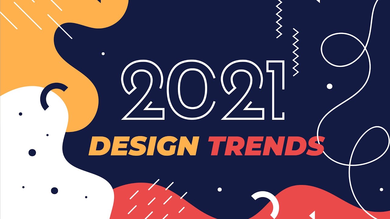
Graphic Design Trends 2021 - read the full article about web design trends 2021, Web design and from Yes Im a Designer on Qualified.One

Youtube Blogger

Here are all the amazing work that we will be looking at in this video and to make it easier for you to find all the references and sources of this inspirational work I included the link for the Milanote board in the description below.
So go check it out and make sure to follow those artists that you like the most.
I organized my predictions for 2021s main visual directions into six categories and I have to warn you in advance that most of the examples are actually illustration based or illustration is in the focus of this trend prediction.
And why is that well first of all because illustration became such an important part of every creative field so it really influences all kinds of different areas and also since I am an illustrator myself these are the type of work that I constantly look at and get inspired by.
But in case you are not into illustration dont worry because I have also many examples from other creative fields like photography, graphic design, packaging and product design, UX, UI and web design and even logo and branding.
But before we jump to our first main category I wanted to talk about two underlying themes that I can see in all of the creative work out there.
One of this theme is a result of the unfortunate pandemic that weve been experiencing this year and all the things that come with it. The staying home isolation and social distancing.
Now although this is a very bad and negative thing that happened to most of us and really affected our life.
On a positive note it also resulted in some amazing creative work.
So you can just see a couple of these here on the left side and on the other hand we also have another very strong theme that is again visible in all creative fields and that is nature and being outdoors using organic elements, organic products and the environment in general.
Now this theme again has been influencing a lot of creative work this year and Im sure its going to continue into 2021.
And the reason I put these two together on my screen is because it is obvious there is a connection there so the fact that weve been staying home so much we are longing more for nature and being outdoors and being free.
And hopefully, if everything goes well in 2021 we will gain back a little bit more of that freedom that we are longing for.
The name of this first category Abstract Minimalism is something I just came up with because its not something I can really define better with any other words.
So its abstract because it uses all kinds of different shapes overlaid on top of each other usually blocked colors so no gradients no shading and that is also why I would call it minimalistic because of these simple geometric shapes and simple forms but another very important factor is the color theme.
Which is a bright vivid color palette.
Its almost you can say oversaturated and one of the reasons for that I feel is because we are mainly experiencing designs not in print but on screen.
And since the majority of consumers now access designs and consume design on their screens it can be a lot more brighter and saturated compared to the traditional print designs.
Now something that usually goes hand in hand with abstraction is the exaggeration and stylization of certain features.
So that can mean exaggeration of the proportions on characters like large feet, large hand but it can also mean the oversimplification of object sometimes to a point that is almost unrecognizable.
The circle is considered most of the time as the perfect shape so of course, it is very heavily influencing a lot of compositions but in 2021 I expect it to become even more relevant and we can see many examples of it already showing.
Apple, for instance, is using it a lot whether it is a radial symmetry that they have on their shop or the compositions for tv series and movies on Apple Tv but we can see more of concentric compositions even in branding and logo design.
And there is actually one less obvious but also very relevant style that is really making a comeback and that is the round table.
Especially for motion design and animation where you have a rotating piece that is going to reveal different details as it goes along.
And the Halo advert for Amazon is a beautiful example of this but you can also find many other subtle examples of it either in adverts or in illustration as well.
We have many tutorials and videos on radial symmetry and concentric compositions and how to create them using tools like Illustrator, Photoshop.
If you are planning to learn these type of techniques you are already in the best place so make sure you subscribe to the channel so you can be among the first to watch our new videos that we release each time and also in case we are doing live streams, you will be notified to make sure that you dont miss it.
This really cool visual trend obviously again stems from drawing and illustration but then it influenced all kinds of other areas of design like fashion and even product advertisement.
The characteristics are really the combination of block colors with empty lines.
This animation is a perfect example of the traits and characteristics of this style anything that is stylized meaning that its not completely realistic is challenging the viewer to fill in certain gaps and in this case is those block colors that in certain parts are missing.
Even though this is a photo and doesnt have any graphical elements it also still ties into this trend by having that transparent raincoat with the strong white outlines.
So once again you have your filled shapes and the empty lines.
And this style can even work with a combination of photography and graphical elements where only a certain part of the actual product is revealed and the rest is simplified with those simple blocking shapes.
In this example, the empty lines are only used on the typography but it is still part of the general aesthetic.
Now remember what I mentioned about the general theme of nature and using organic things here we mainly have organic shapes so we have round and curved objects and in case of animation, you would normally have very fluid and continuous motion.
This is a really cool style thats already established but I feel like its still emerging and mixing with other trends that we are seeing currently in the creative industry.
So definitely worth keeping an eye out for it and try to implement it in your work even if you are not into illustration.
Here is another trend that is still going strong and expected to continue in 2021.
Even though we already covered it briefly in our last years predictions I couldnt leave it out from this video because I am seeing so many amazing examples of it.
So last year I called this style and trend Clay but I feel like its better to call it Tactile 3d because its all about making things look like they are tangible real objects and whether its made of clay or something else is just that aesthetic that makes it look obviously very stylized as if it was a miniature and was created for real but most of this work is created in 3d. With the use of heavily stylized characters with realistic motion.
Now I already mentioned the turntable animation when we were talking about concentric design.
It is also relevant for this trend and again Im referencing the Amazon Halo advert but in general being able to turn around or walk around objects is just something thats very connected to this visual direction.
I particularly love this project which was used for the grand opening of a shopping center in China.
Where these 3d characters that were originally used in animation and the promotion for the center eventually ended up being displayed in the center itself where viewers could walk around them and even interact with them.
Before we continue I just wanted to let you know about our creative membership program.
For a small monthly fee, you get access to over 200 hours of Adobe Certified online training courses.
Master all the tools and skills needed to become a professional Graphic Designer or Illustrator.
As a Pro Member, you will get mentoring from me and my team access to webinars, student forum and creative briefs to help you build an outstanding portfolio.
Pro Members can also download the project files for all of our YouTube tutorials.
Sign up at yesimadesigner.com/memberships and start your Free Trial today.
And now lets head back to the tutorial.
Now this category or trend is not particularly a style this is more about the composition or how compositions are created.
Containers are these useful devices with which you can create a little environment in your composition.
It helps to eliminate the use of background and the blocked shape of a rectangle or square that you would normally get with a photograph and thanks to the flexibility and interesting silhouette of most of these creative work its great to use them for editorial design, web design or even for apparel.
So the main characteristics of this trend is to use these creative containers that really frame an environment but allows for elements to come out of it and create some motion and interest and the best way to describe this direction is that these are all compact storytelling devices.
It works really well for illustration but we can also see examples of it in product photography and also in web and UX design.
Another visual trend that is really reinforced by the easy access to digital drawing tools like Procreate and Adobe Fresco.
The tools that can really replicate and simulate traditional media like watercolor, charcoal, crayons or even oil painting.
For instance, in illustrator with the clever use of effects and textures, you can quickly turn that rigid solid vector outline into something more organic something more raw and unpolished.
If you are interested to learn this particular technique using the grain effect I have a two-part video tutorial here on the channel the link is in the description below make sure you check that out.
But on my screen, you can see lots of amazing examples most of which are actually digital just made to look like its using traditional media.
Of course, there are artists who are actually doing these arts and crafts techniques like linocut and paper cutting for real but then they just enhance the final composition in digital applications like Photoshop.
Theres one thing that really connects all of these artwork together and thats the fact of embracing imperfections and the human error.
Even an animation film called Wolf Walkers which came out on Apple Tv recently was an amazing example of showing the original sketched lines in the final animated movie.
So when you are looking at stills its very easy to spot these sketchy lines which really adds an additional depth and interest or intrigue to the composition.
And since we are talking about this animation I also loved how they played with perspective and sometimes combined two completely different views like having a top view in the background while we have a side view in the foreground and sometimes even 3d and 2d viewpoints are blended into a single composition.
So if you havent seen this movie already I highly recommend to watch it because this is really a visual feast and also its quite close to heart because one of my good friend Almu Redondo worked on it who helped me to create a course about character design a couple of years ago.
If you are interested about this you can check it out from the link in the description below.
Last but not least I wanted to mention that learning about visual trends is very important and its not something that you need to blindly follow and use in your own artwork.
Its more about being inspired and trying to fuse these things together because visual trends are always emerging from other trends and the best way to think about them is that you need to put them in a blender, mix them up and then you will get this infinite amount of possibilities coming out of mixing specific traits of each of these directions.
So on my screen, you can see already a few examples of these crossovers which I couldnt categorize as a clear-cut direction its more about the fusion of those categories that we already covered.
So, for instance, you can see many examples of the Abstract Minimalism with Tactile 3d or the DIY aesthetic with the concentric design and even styles that you wouldnt necessarily consider a good mix can really work well like the hand-drawn approach with the Tactile 3d.
So even though this is a 3d render it still has the tactile quality of a miniature but also that visual aesthetic from the filled shapes and the empty lines that we discussed earlier.
So as one creative to another my advice to you is to really learn to infuse the different directions that youre seeing being relevant or trendy and give yourself time to experiment with them and see where it goes.
By doing this you might be the one setting the next trends in 2021.
Thanks a lot for watching I hope you found this video useful and once again have a Happy and Creative New Year.
Thanks a lot for watching, like and share this video if you enjoyed it.
Dont forget to subscribe and hit the bell icon to get notified whenever we release new videos.
Click on the link on my right and start your membership today to get access to over 200 hours of training courses and personal mentoring by me and my team of creative professionals.
Have fun learning guys and I will see you in the next one.
Yes Im a Designer: Graphic Design Trends 2021 - Web design

