In Web design
Design a simple UI from scratch for a Food App in Figma - For beginners - read the full article about Figma, Web design and from DesignCode on Qualified.One

Youtube Blogger
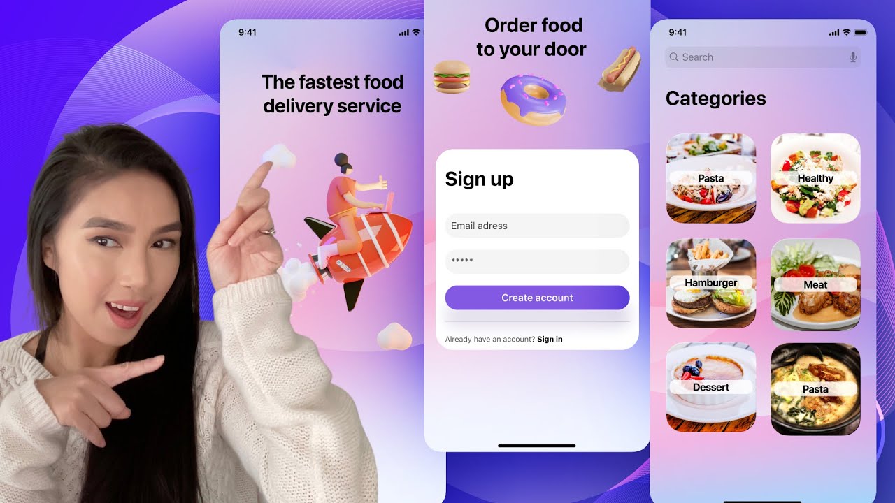
Hi everyone, this is Sourasith from Design+Code team. Today, Im going to show you how to create Easy UI design, but before we get started, I want to wish you all a happy new year may all you wish come true. So lets do it! Before we get started, I just want to show you some resources. If you want to find idea, I suggest you to go on this website. You can find a lot of illustration, inspiration. I need you to download some template on this website, Apple Design Ressouces, its free. Today, Im going to use this font. So you have to download SF Pro, this is what Im gonna use for today and Figma UI kit. You can have it for free. Today, I will use Design+Code UI kit. Okay, now that you have your frame, go to asset. And were gonna add status bar. And then, home indicator. Im gonna add dots. Now, you need a title. Im going to use San Francisco Pro Display. And for the title, it must be 34. Now that you got your title, you need a illustration. So go to Community, you can find a lot in Figma community. Im going to use this one from Sally. Im going to take the first one. Okay. I used this one because I need an illustration that showed that my service is fast. And I think this one fits very well. You should keep your design simple but never let a blank page. I will go with blob design and I will play with color gradients. Were going to start with ellipse. And go with solid. Im going to take this color, I already prepared all my colors. Go to effects, add layer blur and put 200. I have to put your background the back. Okay. Im gonna draw a blob. Im gonna make it bigger because I want to use angular. And Im going to add my four colors. Im going to put it 30. And again, I gonna put it in the back, like this. Im going to create another blob. You can use a plugin in Figma but I like to do my own. Make it bigger. Im gonna copy properties, the last blob that I did. Copy properties and I paste properties like this. Add another blob, go to angular again, and Im gonna add all these four colors. Im going to add effect, layer blur, youre going to put all your blobs together, group together, and rename it Background. Like this. I just want to put my frame, 30 on the corner radius, like this. We finished with the first screen. So you duplicate. Delete everything except the status bar and the home indicator. I suggest you to move a little bit the design just to make it a little bit different than the first one. If you see the point, you have to make you shape bigger. So you not gonna see the point. Im going to have something more. Now that Ive modified my second screen, this screen is going to be the sign up page. Click on "T" to write your text, San Francisco Pro Display... Text, sorry, 17, semi bold. Select the label and click on shif+A to add an auto-layout. If you see this, its an auto-layout. So you can a fill too and the colors that Im going to add is this one. Put it the center, radius 30. And go here, Alignment and padding. So place in the center. Okay, now were going to add stroke. Gonna take the color white. Go to linear. This one is going to be zero. This ones going to be 16. Were gonna add, effects, drop shadow. Were gonna add another background blur, I put it 60. So now what are you going to do is to duplicate. And Im gonna change the color, black and put it 5%. And gonna change the color of my text. Im going to put it 70%. You can add an icon like a lock. So you have to change the place, on you left. Now Im going to duplicate again. Were gonna write email address. Change it to regular. If you want to put an icon, find a mail. like this this one. I think Im going to make it simple, Im not going to add icon. So I decided to keep it simple. So lets move to the next step. Im going to add Sign Up. Im going to use San Francisco Pro Display, bold, 34. So align your text with all the labels. Were gonna create auto-layout, so shift+ A. So now its an auto-layout but Im not going to add a feel. Now you need a separator. Draw a line or you can go to assets and find separator. Already have an account? Sign In. Take regular. Now Im going to do the same thing, Im going to put into an auto-layout, shift+A. Youre going to select everything and we gonna make it an auto-layout. Make sure that you select everything. And then shift + A. Youre gonna fill like this, center. Now youre going to put here 30 and left and a side, put it 16. The number Im going to put it 20. Were going to put 30 on the corner radius. So now we need a tittle and some illustration. So again, Im going to find it in Figma community, 3D food illustration. Okay. I dont have a lot of choice, I only have two. And then Im going to take this one. Okay, now I find my illustration and I need a title for this. Order food at your door. Okay, now lets move to the next step. Again, youre going to duplicate and remove everything except the status bar and home indicator. And were gonna modify a little bit just to change the design. On this third screen, Im going to add a food category. Im going to add another blob Im going to use linear, Im going to add three colors. On this third screen, Im going to add a category of food so you need food photos. So I will take my personal photos. Draw a cube, 155 to 155 and put 10 on the corner radius. And what Im going to do. Im going to copy properties on this sign up card. So go to image, choose your image. I have my first photo so this category gonna be pasta. Im going to use San Francisco Display, 18, bold. I select, Im going to put an auto-layout.Liar. Gonna add fill, color white, gonna put opacity 80%. Like this. And I want my dimension of the label to be 127 to 24. Im gonna go here and put my text center. What Im going to do, Im going to select everything here and Im going to group them together. So command+ G, Im going to rename my layer pasta. So, what are you going to do, I need six category. So I have to duplicate five more. Now that I have my 6 category. Change the image and change your text. Okay now that you have all you category. Just to mention you that I put 10 on the corner of the . radius. So now I think its better. So now Im gonna group them together and dont forget to change the name of your layers. Something missing on this screen and it is the title. What you gonna do, you can duplicate this and just change the title. Categories. And Im going to add something. Go to asset and find search. So we are done for today. Thank you so much for watching, I hope this video is helpful. See you next time guys.
DesignCode: Design a simple UI from scratch for a Food App in Figma - For beginners - Web design