
Some details
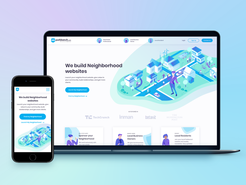
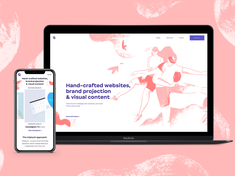
Ester Digital is a design agency which bursted onto the scene in 2015. Three years later the time has come to shine brighter with the complete website redesign.
PROBLEM
Ester Digital',s old website lacked personality, didn',t reflect the studio',s brand values, looked outdated a bit. It lacked the presence of the studio',s services clearly
For the past few years the studio changed it’s focus from strategy &, analytics to design and visuals, and it had to be reflected clearly.
SOLUTION
I had to define the needs of different types of visitors using the site (clients &, studio team). As a result I decided to make an accent on visuals: to use more colour while describing the brand values and less colour where the bold imagery of portfolio or illustrations is going to be.
The website has a simple and easy to understand strucrure, bold headers, it also has balance between content and spare space. Simplicity and accent on unique visuals are Ester',s main features.
As the site appeared to be rather minimalistic, it seemed reasonable to use lots of animations and hand-crafted illustrations.