


Some details
The European Police and Fire Games for 2018 had to be something different from what had been done so far. And above all, they had to have a solid, cohesive and linked graphic image to Europe. It must be an inclusive and dynamic image.
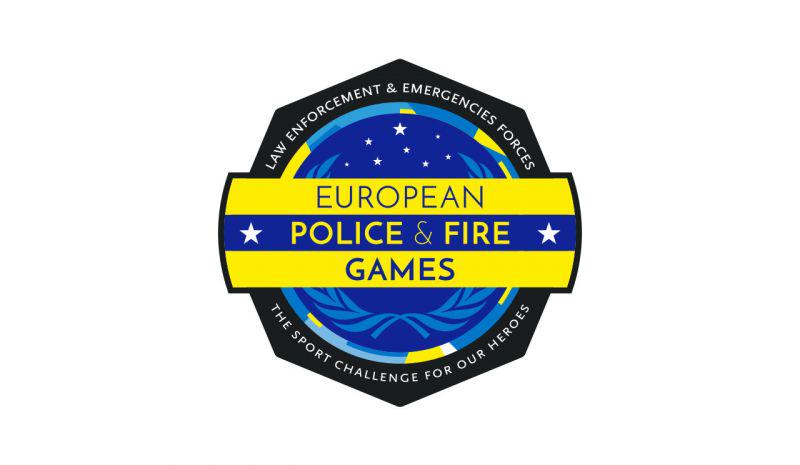
The form of the log reminds the plates, badges and shields of the law enforcement &, emergencies forces, without mentioning any country or state in particular.
The interior
represents a sky crowned by a set of stars, in memory of the professionals fallen in service. Over this sky a laurel wreath is superimposed as a symbol of peace and union between peoples. This symbol is recognized worldwide and used by many organizations and entities, including the United Nations Organization (UN).This crown also refers to the concepts of competition, excellence and reward for the effort.
Surrounding the set, a multicolored strip of irregular shapes, represents global diversity. The colors chosen, except for the light blue, are the same used in the Olympic badge. They have been combined in such a way that the brand is related to the colors of the European Union flag.
More info: https://momoycia.com/trabajos/european-games