
Some details
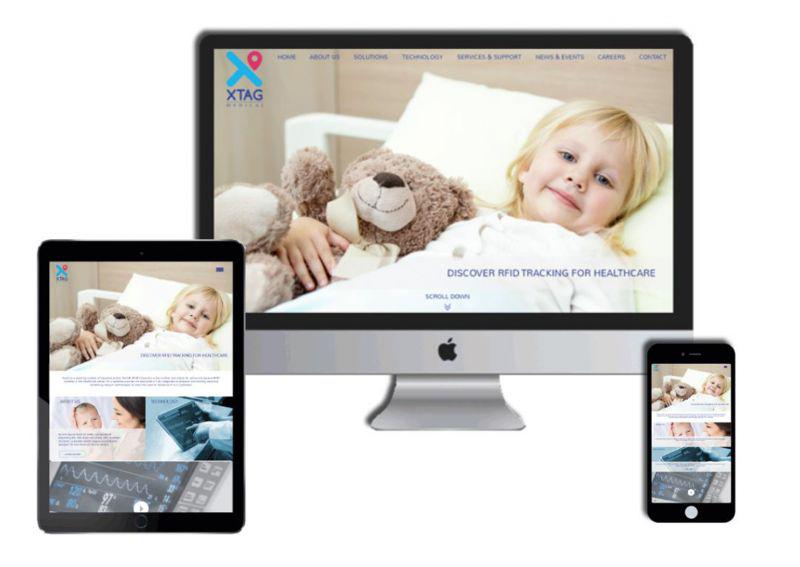
Tagging With A Difference
XTAG is a medical devices company based out of the United Kingdom. We were first tasked to create a new identity for the brand which would depict the essence of what the brand stands for. The brand focuses on having a tagging system for a mother and baby, asset tagging and patient tagging. Once we got the brief, we worked on creating a few designs which kept the tagging aspect
as the core to create the identity. The location icon attached with the name of the brand and a font typeface which was friendly was what was decided on and thus the rebranding of XTAG was done.The Digital Tag
We created a design which was clean, sophisticated, showcased all that the brand is about and informative. The animations and flow of the website is easy to navigate and is a testament to great UX and UI design