
Some details
When the Channel H team joined our roster, they were working on a big idea: completely transforming healthcare by changing the way patients and healthcare vendors collect, track and share health-related data.
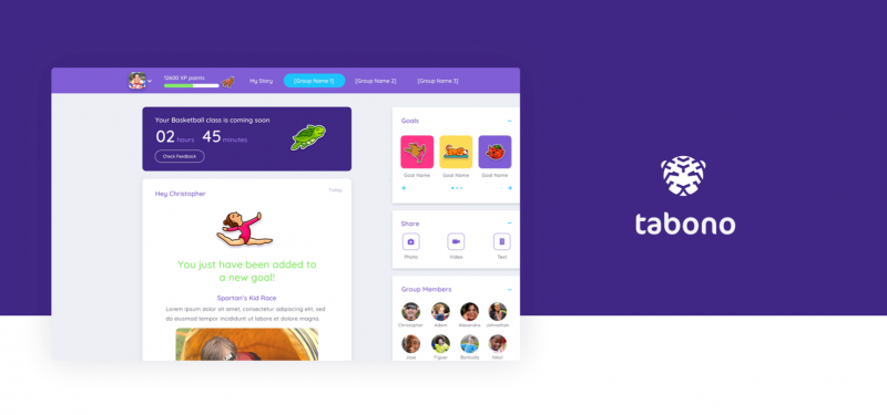
With so many different data sources to connect and display, we would need to carefully craft a user experience that toed the line between being informative and overwhelming. We started by producing user flows,
sketches and wireframes that would serve as the skeletons to Channel H’s intricate content.With data sources and potential audiences still relatively undefined, the Channel H team needed flexible user interface and design kits that could adapt to the company’s evolving capacity and uses, so we created elegant designs for key pages such as the Welcome, the Sign-up and the Client portal pages. We then set to work fleshing out entirely new user experiences and interfaces for the mobile app.
The roadmap
Create initial designs, wireframes and flows for both mobile and web
Build foundational yet flexible UI kits
Create strategic templates for intuitive metric visualization
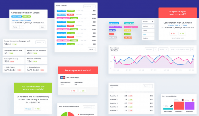
Last but not least, we worked flow-by-flow to design a myriad of dashboards and graphic representations that could accommodate and compare complex and diverse data points like medical histories, prescriptions, scans, diagnosis requests and more. Finally, patients would have the information and tools they needed to be proactive players in their own health.