

Some details
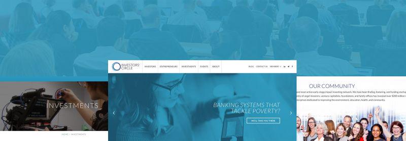
Investors’ Circle’s established record of 25 years serving the impact investment community needed to be one of the primary brand expressions of their new logo.This meant not re-inventing their brand expression, but rather modernizing it. In order to accomplish this, we were able to keep their new mark similar with a three-faceted circle, staying in the same blue color scheme with a modern variation as well as by keeping their
typography roughly within in the same font-family.Another challenge laid in the the complexity of Investors’ Circle’s target audiences.Having two very high-value target audiences (Entrepreneurs and Investors), IC needed to be guided through prioritizing one or the other on their customer funnel on their home page.Through some quick consulting, we were able to together decide that focusing on Investors was going to be more important, and this yielded in a homepage that spoke primarily to Investors, with a few separate calls-to-action for Entrepreneurs.