
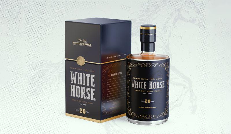
Some details
THE PREMIUM TOUCH A 20 YEAR OLD BLENDED WHISKEY NEEDS
In this rapid redesign concept we analyzed the positioning of the mid-range whiskey White Horse brand and applied it to a new premium product.
White Horse',s packaging labels had a big number of issues:
• Composition with negative space problems.
• Problems in the application of the brand logo, since the frame of the
logo has a complex shape.• Classic colors of its premium label, lack of differentiation in a competitive environment.
• Repeated elements.
• Too few graphic resources to play with.
View more of Pesto',s projects in our website: https://pesto.com.uy