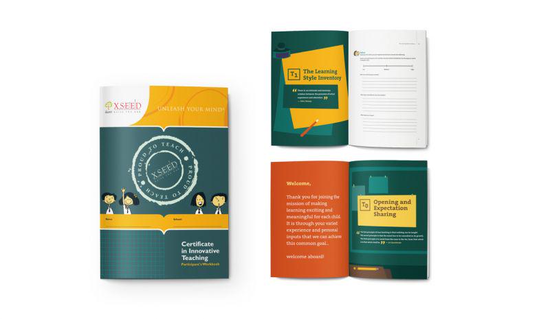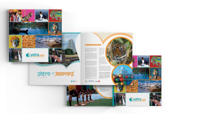

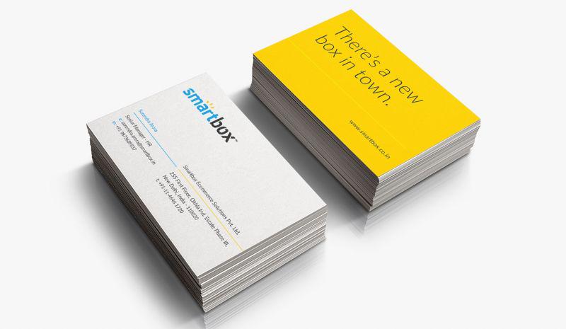
Some details
Samtel is India’s renowned integrated manufacturer specialising in high technology products, systems and equipment across various industries.
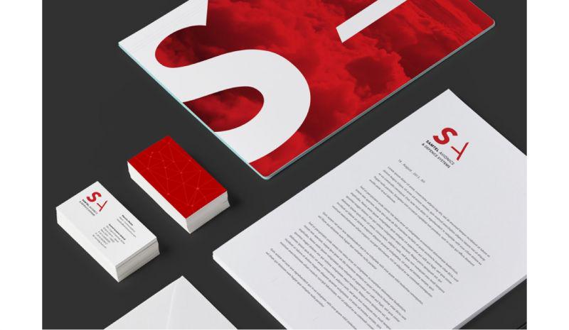
Samtel had expanded itself into the avionics industry for providing equipment and systems for high end applications in armoured vehicles. Samtel had been using its parent logo for its avionics brand as well. Nevertheless, Samtel was quite aware that it required a fresh and
exclusive identity to cater the avionics industry which had some representation of its parent identity.Samtel, as a parent brand had collected huge amount of credibility in the past four decades. Keeping in mind the powerful influence of Samtel as a parent brand, we designed an identity for Samtel Avionics which carried Samtel’s personality but looked more edgy to represent the air force.
The color was picked up from the existing Samtel logo and the initial was tweaked to make it look edgy. Similarly, the initial ‘A’ from avionics was designed to look comparatively sleek but more sharp and forceful that portrayed the cutting edge avionic technology offered by Samtel.
We introduced graphical elements to design a futuristic visual language. The concept of connecting dots came with the idea to portray technological innovation and Samtel’s contribution in the construction of a complete and fully equipped system. The identity formed a clear reflection of Samtel’s personality and ambition.