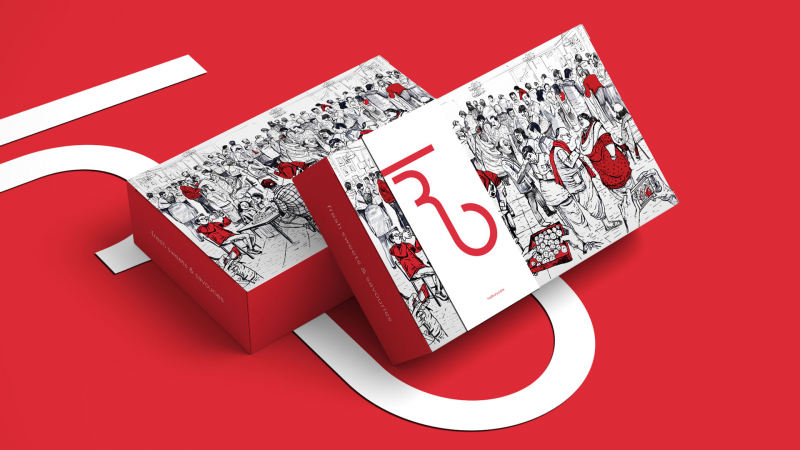


Some details
It’s the story of a brand that hired a little agency to travel the seven realms in search of answers, answers that were eventually found by looking deep into the soul of the brand and its people. Much like the ruby slippers, the answers were right here all this time.
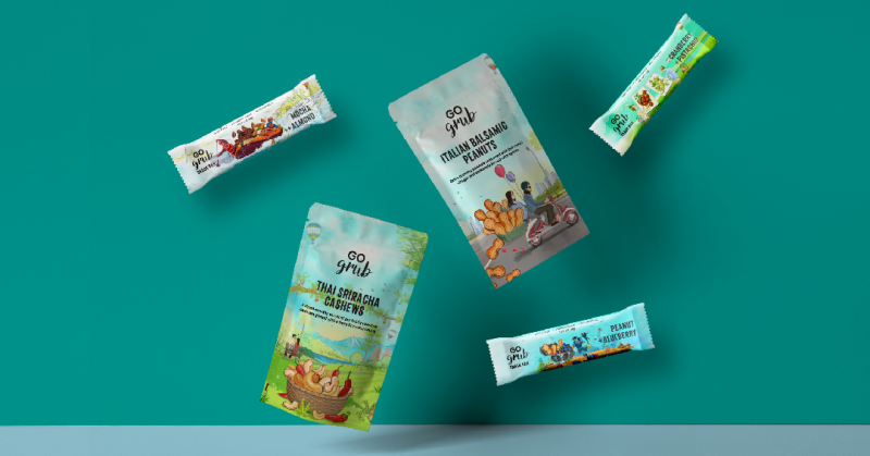
That was our quest with Go Grub, a Delhi-based company that made and sold nutritious snacks. To us, package design seemed like the only task that they
required. Go Grub appeared to be market-ready. Their tagline – Rediscover Snacking – was on the money. So, why would they want to improve what’s already good? It was only then that we scratched beneath the surface and became obsessed.Every brand stands for something. It’s a proven strategy that helps consumers distinguish a brand from its competitor. How should Go Grub position itself? In order to arrive at that, we needed to understand our target groups. We went through the brief and existing brand persona over and over, all while painting a mental picture of the brand and, lo and behold, we re-emerged from the creative rabbit hole with our fluffy white tails dirty and our minds enlightened.
A wise man once quipped “the most unjust separation of all, is the separation of a fellow man from his cool ranch flavoured snack.", The key reason for this separation was a human emotion – guilt. Yes, guilt over health, taste and nutrition drives people away from their favourite snacks. Go Grub, in our eyes, aimed to remove that guilt from snacking, by offering a range of nutritious products that did not compromise on flavour.
The question was, how do we convince the TG to put down the can of Pringle and pick up a Go Grub snack?
Which meant that our packaging must also speak the same language. Each product must tell its own story right from the packaging. Memories were to be layered – package being the first and product, the second. The first layer must remind customers of the place they’d been before, an illustration so powerful that the mind can recreate the sights and sounds of the place.
Adventure is the brand’s id. We sought for bolder, edgier typefaces, colored the canvas with lush greens and blues, and the characters were imagined as two relatable people in search of a great adventure. To them, we say, go on and indulge.