
Some details
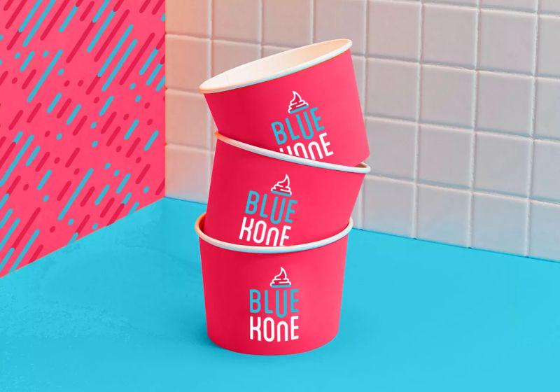
We wanted to create something that was perceived as an extension of the product – the ice cream. We chose the color Blue to represent the first half of the brand name. The cool blue tone was used to invoke a sense of cold and chill, as one would naturally associate with an ice cream. For the second half of the name i.e. Kone, we decided to use a contrasting magenta tone to create a vibrant and youthful imagery.
The two
colors blended organically and carried a sense of ‘there’s more to this ice cream’. As a top up, we added a simple and easily understood illustration of the characteristic ice cream swirl, (that changes with communication indicating diversity in flavors) on top of the letter U. Together they look like a typical ice cream cone.