
Some details
Services:
Brand Strategy/ Brand Story/ Brand Identity/Photography
Problem:
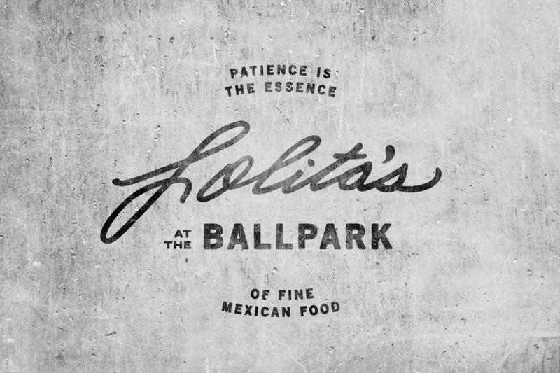
While Lolita’s Restaurant locations were cropping up all over town, the company was experiencing a major identity crisis. The company logo was being manipulated across each restaurant location, diminishing brand equity and the company’s ability to transition into the fast casual restaurant industry.
Insight:
We knew
from research that we an intensely loyal generation of guests but the neighborhood mix was changing, with new families that had low awareness of Lolita’s.Solution:
We started by honoring Lolita’s Restaurants’ legacy of cuisine, culture, and community, letting it serve as our North Star for brand rejuvenation. BLVR stayed true to Dolores “Lolita” Farfan’s signature and the multigenerational, family-owned history of the restaurant chain, but we added a modern twist. We updated the logo type from green to black, with softer, classic italicized lines—a design mechanism to infer forward movement. Even further, we used a heavier-weight typeface to convey boldness and strength in both the community and the industry. Working with Paula Watts and Sam Wells we created a high-quality, mouth-watering photographic approach—highlighting the fresh ingredients, food-preparation process, and overall lifestyle and atmosphere.